Project brief:
To create a online networking and support community for the millions of UK self-employed or home workers.
My approach:
- Created a responsive website by interacting with the stakeholders, collecting their business objectives and taking through the mockups when the design options were ready.
- Established the brand identity - creating the logos and setting up the colour scheme.
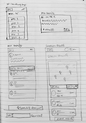
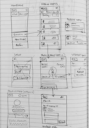
- Performed competitor analysis, created sketches, wireframes, user flows, visual design, writing interaction notes for the developer.
- Involved in UAT to make sure the final output is as per the supplied visuals and guiding the front-end developers accordingly to fix the issues.
We successfully completed the first iteration of the designs and development, tested with the user group. The feedback was navigation is simple and easy, they understood the main objective of the site, but a few of them felt the design looks dated and it is not responsive.
Based on the feedback, I started thinking about a design solution which works for Desktop, Tablet and Mobile, like hit areas spacing around the design elements etc.,
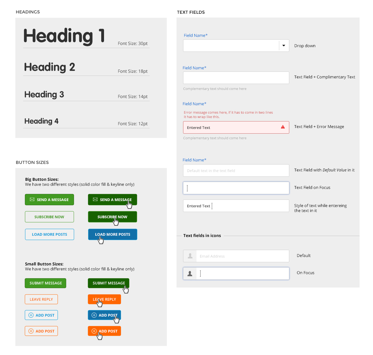
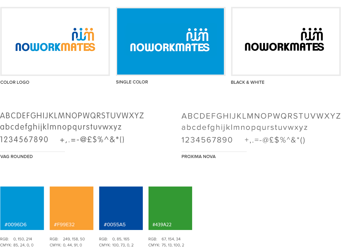
Branding
Created Brand Identity, Font selection, Primary Colors to differeniate the categories.
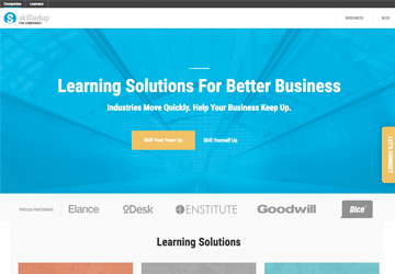
Competitor analysis
net4mums.com, Chiswick forums, streetlife, Quora and few other discussion forums to understand how they work
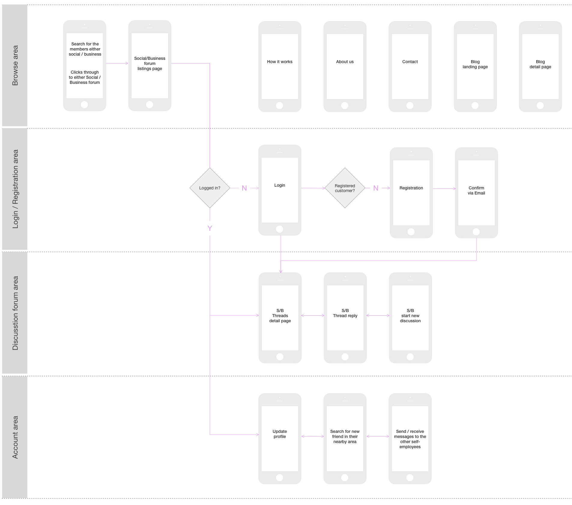
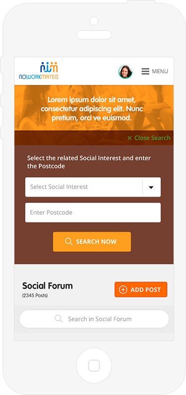
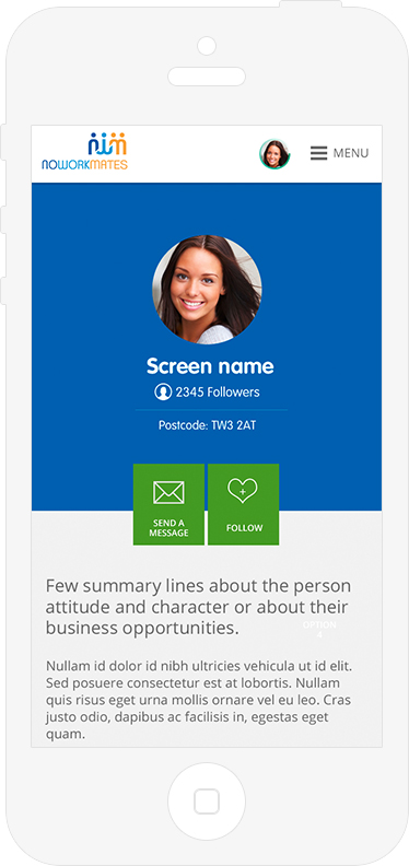
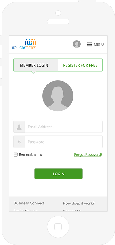
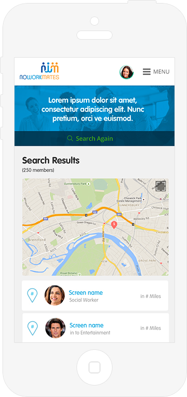
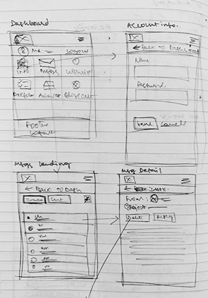
Showing the flow addressing the functionalities in the Browse, Discussion forum and in the account area of the site.
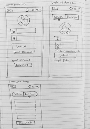
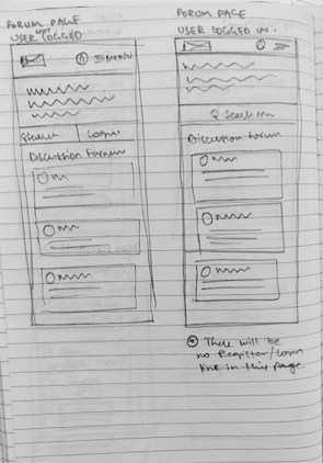
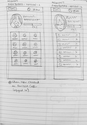
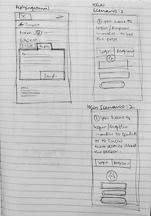
Sketches
Before jumping in to wireframes/designs, made some sketches to take the client through my ideas on the layout structure for the mobile version of the site.

Design Decisions
Below are the few design decisions we took based on the user testing for Homepage banner designs .
We initially started to using icons related to that category and the faces of the People on the banners in small circles.

We realized some human emotion and engagement is missing in the banner so we started showing the pictures in black and white, but the relation of the colors for both categories is missing here.

So we made a 3rd option balancing the human emotion and the category colors.

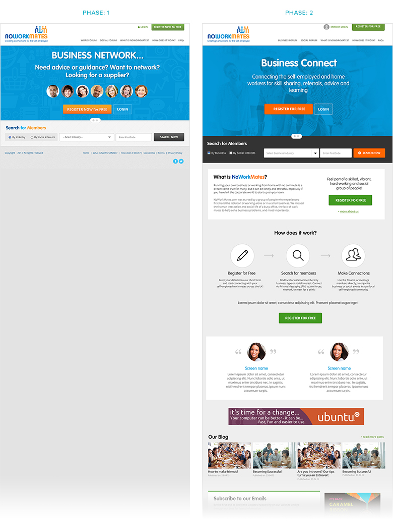
Phase 1 Vs Phase 2
Listed below are the important pages of the site showing the difference before and after the User testing.
Phase: 1
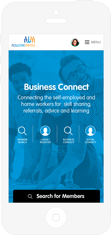
we have only the banner with the copy explaining the objective of the site and the search box. The search box was not really standing out as it was in the gray box. Client's is really keen not to have a scroll bar on the homepage.
Phase: 2
Considering the SEO and want to use the real estate of the Homepage wisely to tell more about the objective of the website and encourage users to register by showing some social proof (Eg: Testimonials) finally we dismissed the idea of not having a scroll bar on the homepage, thus we have added on to the homepage.
- Changed the Search bar to dark gray, to bring more user attention.
- Section to show 'How it works?' About NWM, Testimonials from the members has been introduced
- Introduced Blog so there will be a fresh content on the site which helps users to revisit the site and also an advantage for SEO purposes.
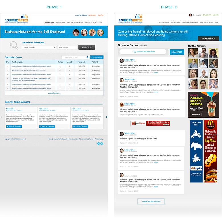
Phase: 1
I took the conventional way of showing the forums.
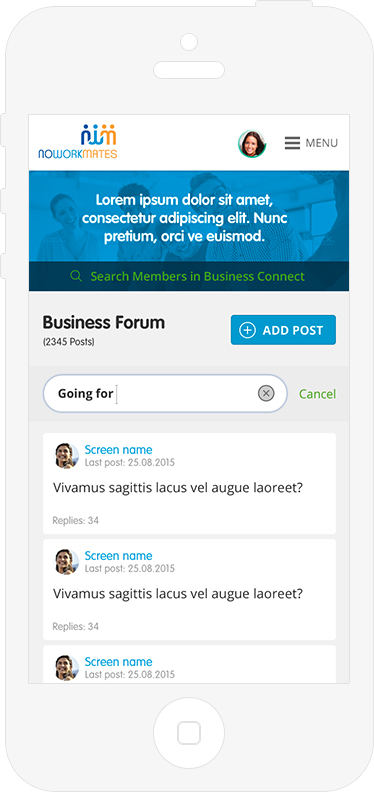
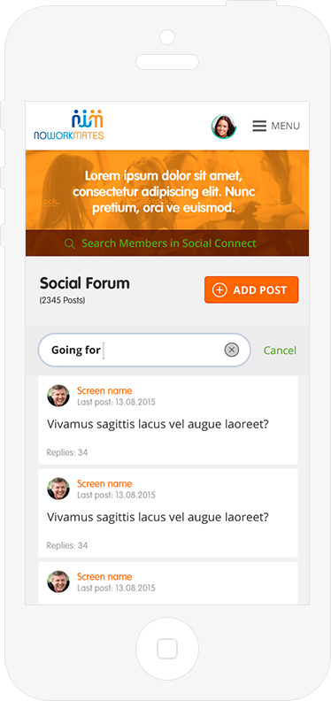
Phase: 2
As the conventional way of forum design doesn’t work for responsive went with boxy types so with this we can maintain the style consistently across all adaptations. Clicking on anywhere on he box will take user to the Post Detail page
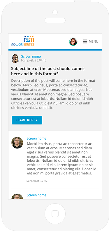
Final Output