Harrods has launched its very first online editorial 'The Review' in the year 2012, which was then a static catalogue showing the information of products, but doesn't link to the purchasing journey.
Project brief:
Online editorial re-design addressing the existing business rules.
Challenge:
Bring both the content and commerce together and creating a seamless online shopping experience.
My responsibilities
- Stakeholders interviews to understand what they want the customers to achieve on the site and what kind of features they would like to have.
- Understanding the insights on the existing editorial.
- Did Competitor analysis on the sites to see what sections and features they have on their sites and how they are presenting it to the customers.
- Created Sitemaps by working on the information architecture and to define the categories, tagging for the articles and think through possible User journeys
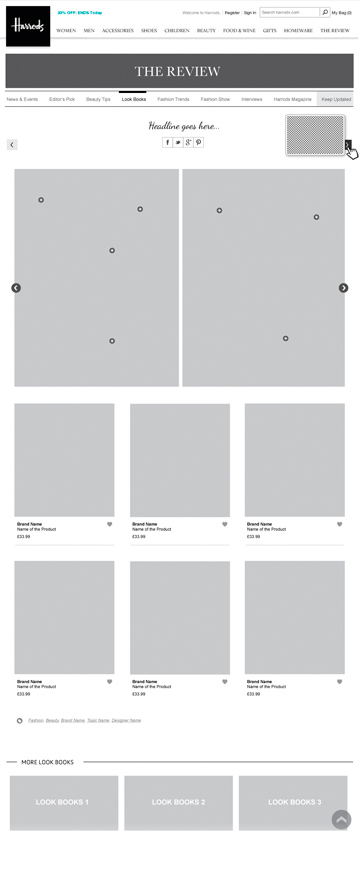
- Created wireframes and presented to the management by articulating the design decisions.
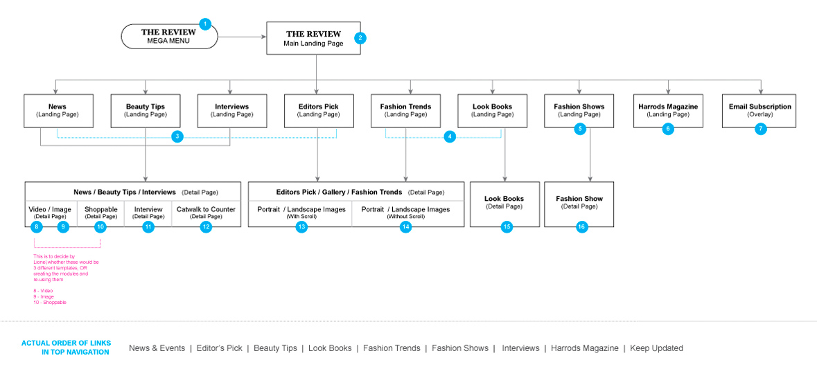
Showing the list of pages and number of templates that has to be considered for this project
Competitor analysis
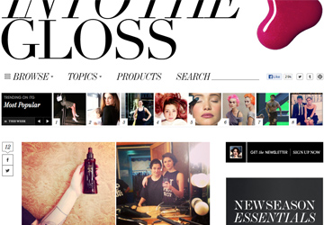
Competitor analysis has been done on the sites Neverunderdressed, Nastygal, intothegloss, Mr Porter, Barneys & districtmtv



Wireframes
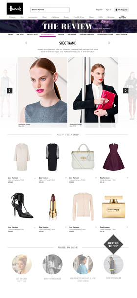
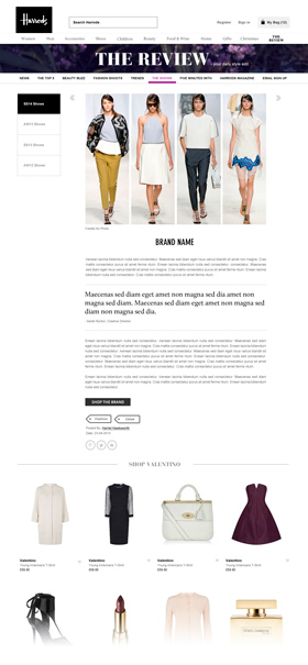
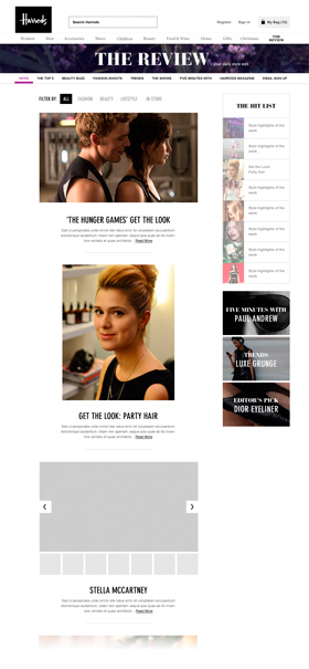
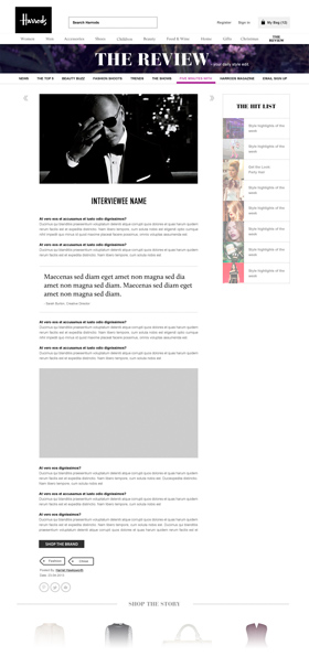
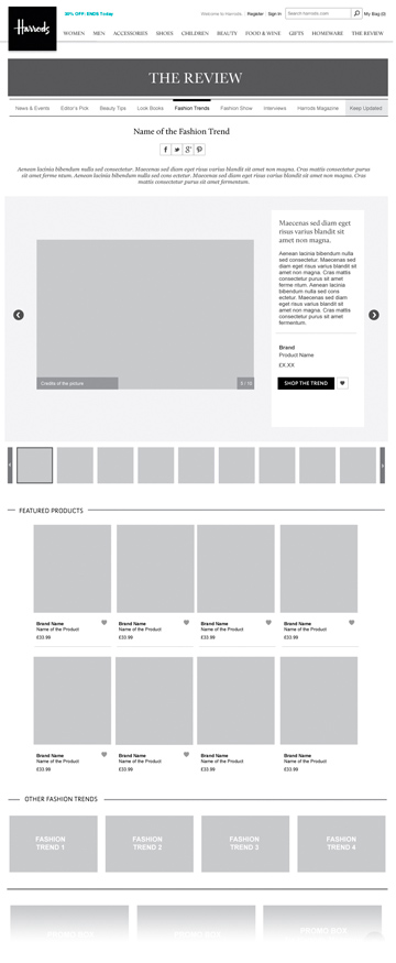
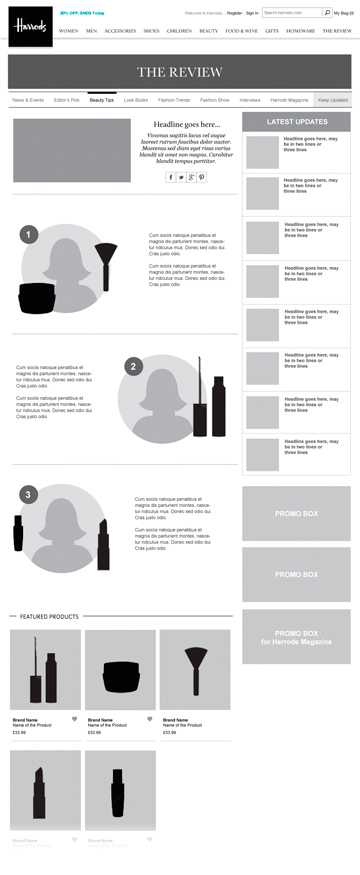
Below is the selected list of wireframes from this project. View full set of wireframes with annotations.

Final Output
This is how the visuals have turned out based on the provided wireframes.


