Based on the User type, there are 3 different types of checkout journeys on Harrods.com:
- Guest User Checkout: User shopping on Harrods.com for the first time.
- Part-registered User Checkout: System has few details of the customer, but they haven't made any online purchases yet.
- Quick Checkout: Customers who have purchased items on Harrods.com.
We realised the Mobile checkout was not performing as we expected, so based on the insights, we figured out few changes needs to be done to make it easy for the customers to complete their transaction. We started looking into re-designing the checkout - Phase 2.
Improvements in Phase 2:
- All pages were treated visually for a neat & clean look, bringing the attention to the elements on which user needs to take the action on.
- Removed the Account Creation & Harrods rewards functionalities in the Guest checkout journey, but the user can still register for an account on the Order Confirmation screen.
- Removed Multiple Address delivery, Add a Gift message and Gift Card payment functionalities on Mobile.
- Simplified Quick Checkout journey by removing unnecessary elements on the page.
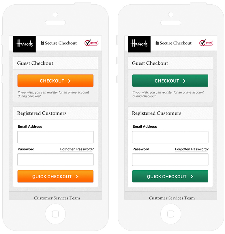
A multi-variant testing has been done on the Call-to-Actions, using two different colours (Orange & Green). Based on the data, we have identified Green colour was slightly better performed than Orange.

This step is visible only to the Guest user. We have removed the Account Creation & Harrods rewards functionalities in Phase: 2, so it helped from the user drop-outs on this step, also the length of the page has got reduced.

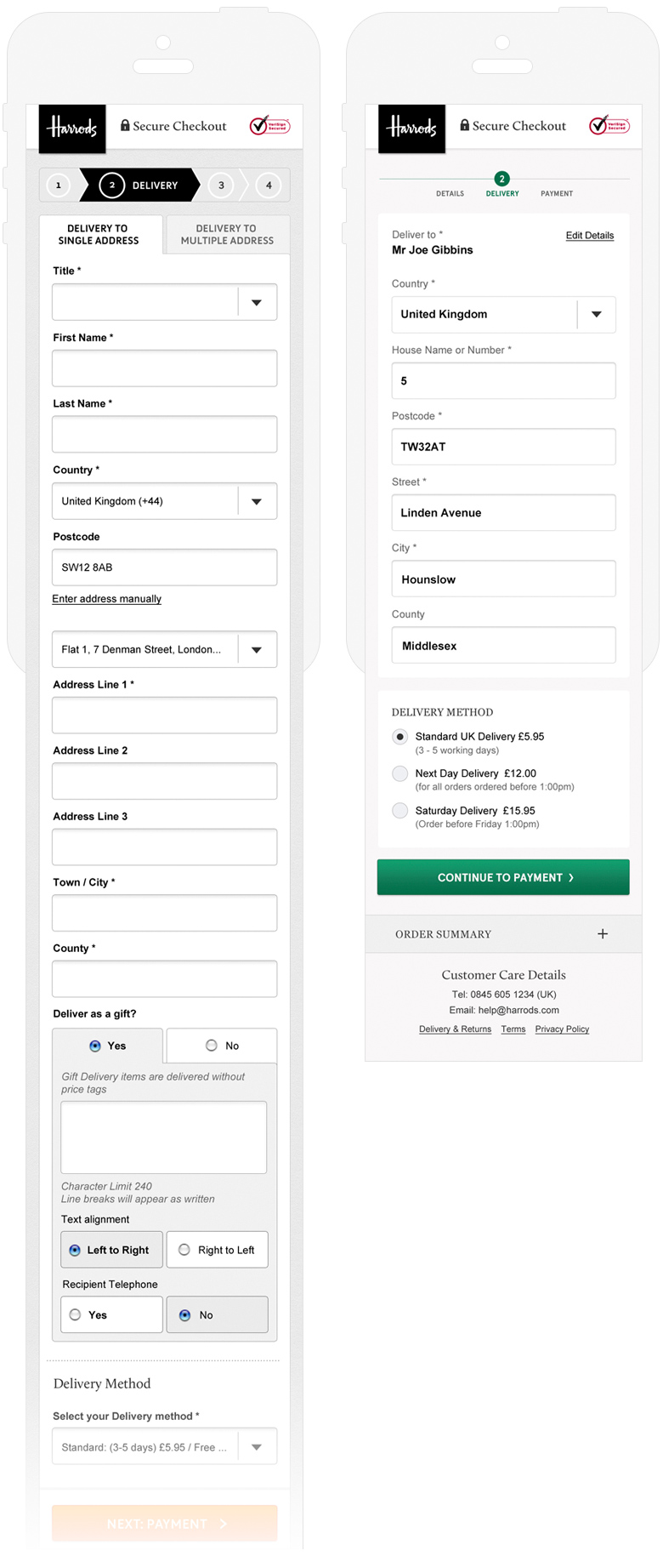
This step is visible for both Guest User & Part-registered users. Removed the Multiple Address delivery & Add a gift message functionalities on this page. On mobile, if the user has to send the products to multiple addresses they have to order them separately.

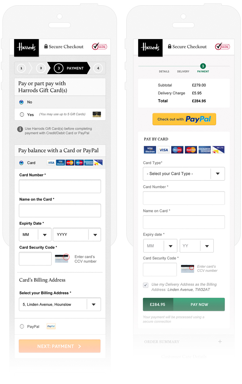
As per the insights, we have understood very less percentange of users are using the Gift Cards on mobile, so we discounted this functionality as it was causing a problem to the majority of the customers to continue their journey.

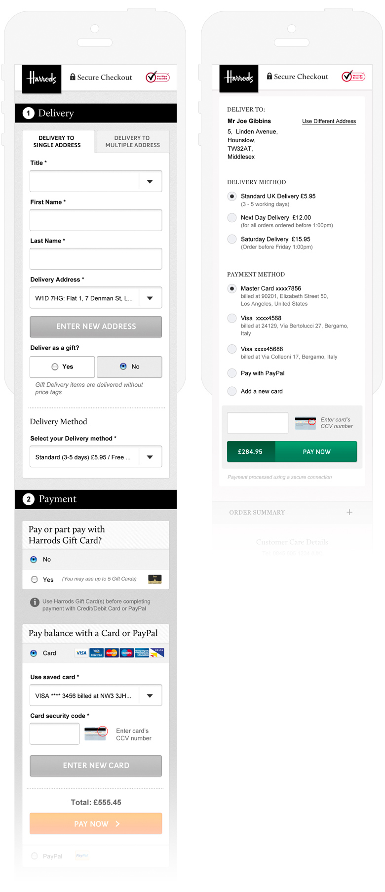
The intention of this type of checkout is, online returning customers should be entering only the CVV number and click on 'Pay Now' button to complete their transaction. After looking at the data, we removed few functionalities which are not used by a majority of the users.

