Capital Cube is a Canadian financial data platform providing investors with stock analysis, screening tools, peer comparisons and subscription-based features.
I was commissioned to redesign their responsive website with the business objective of improving the sign-up and subscription experience, while making the site's large amount of financial information easier to discover, understand and navigate.
Challenge
Capital Cube had a large amount of valuable financial information, but the existing website made it difficult for users to navigate and make sense of that information.
The project involved balancing three challenges:
- There was limited analytics and behavioural data available to understand how customers were using the website.
- The existing backend could only be changed to a limited extent. This meant that the ideal UX solution was not always the most feasible solution.
- The site contained large amounts of financial data that needed to remain accessible without overwhelming users.
My responsibilities
- I worked across the project from understanding the existing experience through to design and developer handover.
- Interviewed stakeholders and marketing teams to understand the business, features and requirements.
- Created a sitemap and reviewed the site's information architecture and content hierarchy.
- Analysed competitors and explored alternative approaches for presenting complex financial information, particularly on mobile.
- Worked with stakeholders and developers to evaluate design options against business requirements and technical feasibility.
- Created the interaction model, responsive designs and visual specifications for implementation.
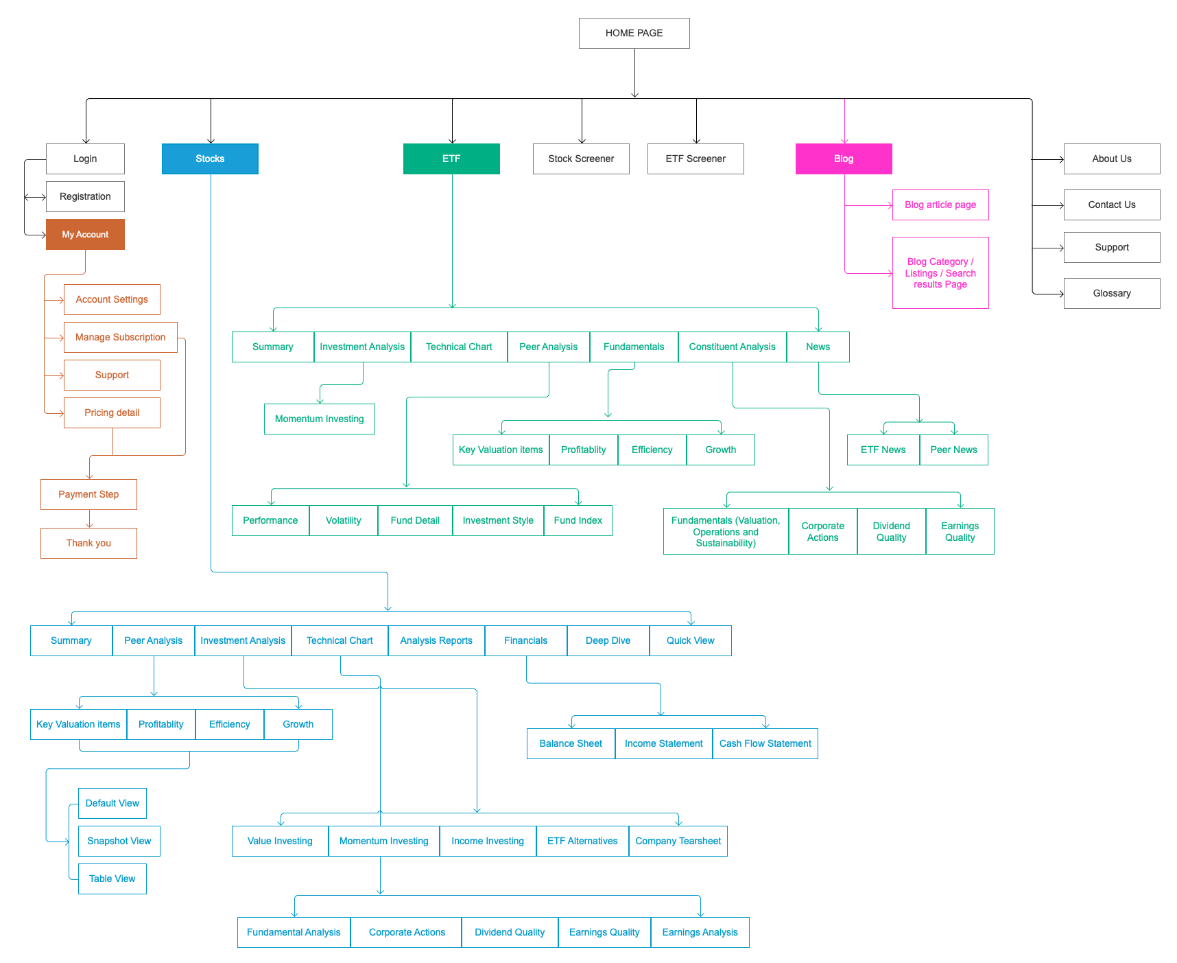
As part of the discovery phase, I audited the existing website and mapped its structure into a sitemap. This helped me understand how information and functionality were organised, identify gaps in the navigation, and uncover pages that were not easily discoverable through the existing structure.
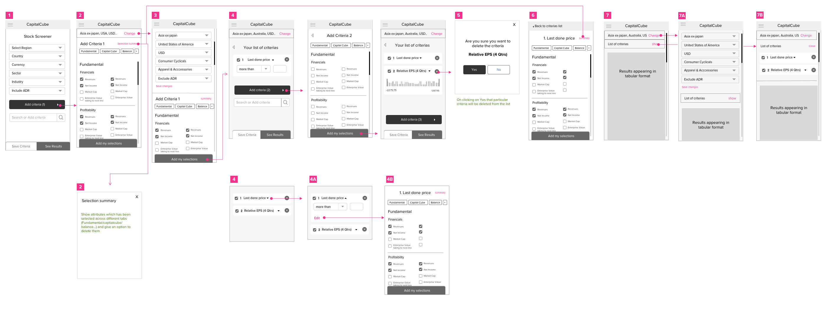
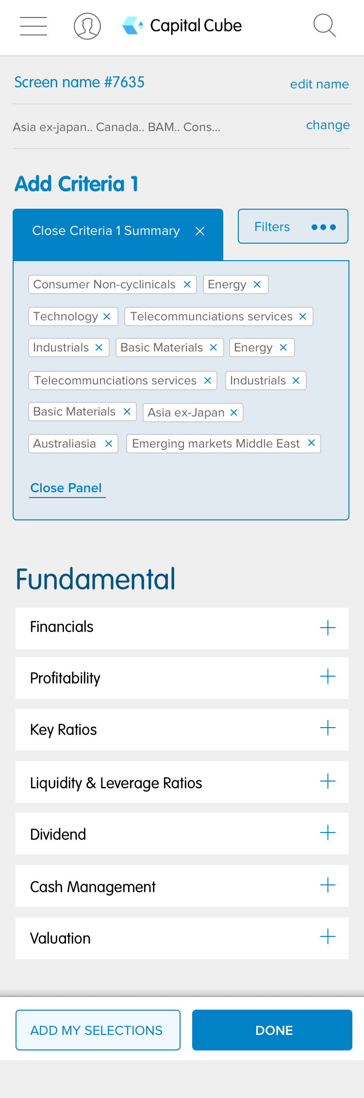
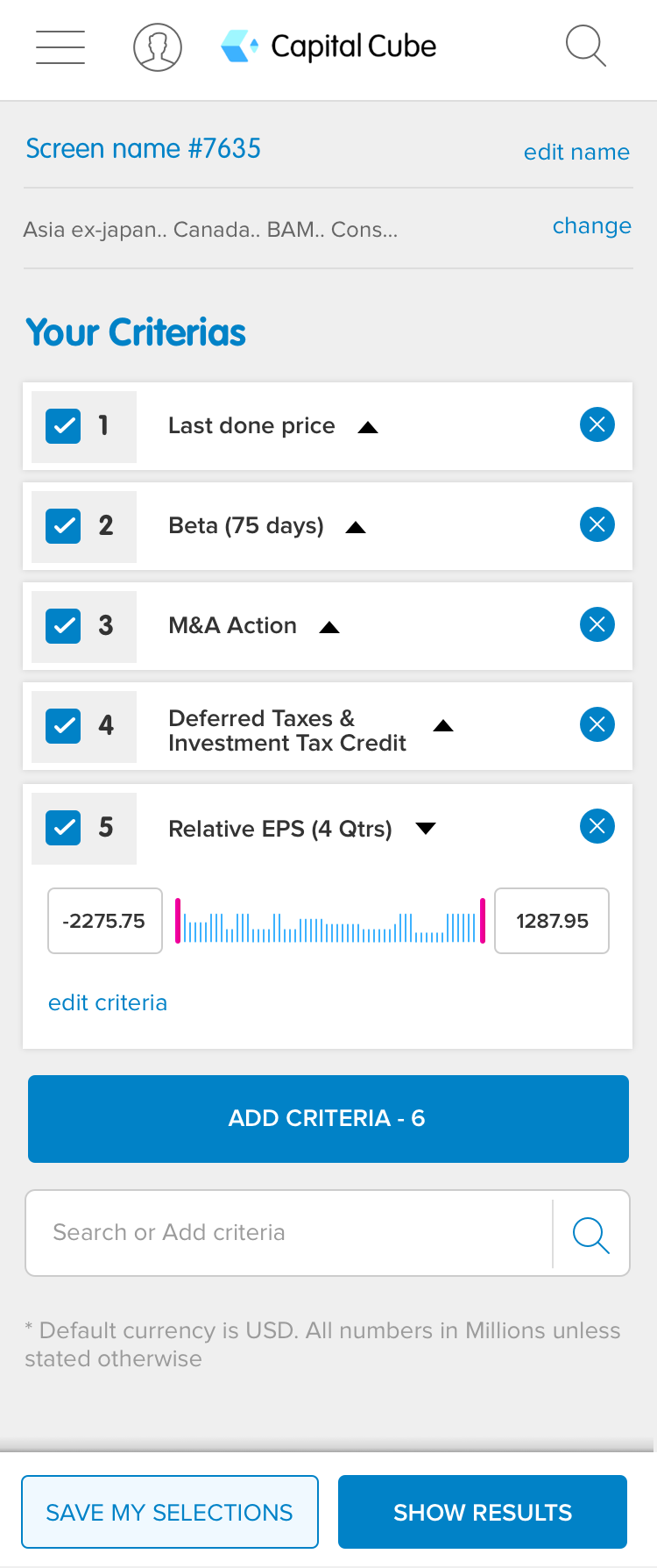
I focused on mapping the end-to-end Stock Screener journey for mobile because the existing experience became particularly difficult to navigate on smaller screens.
Competitor analysis
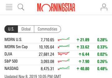
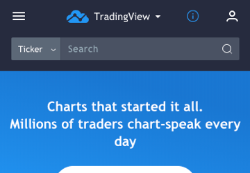
I conducted research across competitor platforms (including Morningstar, Zacks, and LD Micro) to analyze information architecture, tab structures, and financial data presentation across desktop and mobile.
This analysis helped me to identify common interaction patterns and opportunities to improve how Capital Cube presented dense information without overwhelming users.



From challenges to design decisions
Selected screens showing how the key UX challenges were translated into practical design solutions.
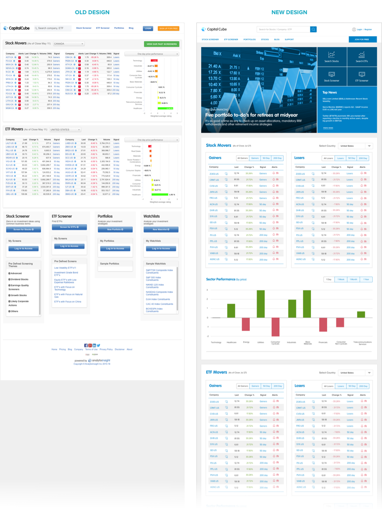
Helping first-time visitors understand the product.
The problem: The existing homepage felt dated and lacked a strong visual and information hierarchy. For someone arriving at the site for the first time, it wasn't immediately clear:
- What Capital Cube offered
- What the key areas of the site were
- Where they should go next
- What made the service valuable
The page was also difficult to scan because sections were not clearly differentiated and the typography was relatively small, so I focused on improving orientation and information hierarchy.
My approach:Rather than treating this purely as a visual refresh:
- I focused on improving orientation and information hierarchy.
- I introduced clearer categorisation of the main areas of the site and surfaced important destinations more prominently.
- The header area was also redesigned to create a stronger first impression and establish a clearer visual identity.
Turning fragmented information into a coherent experience
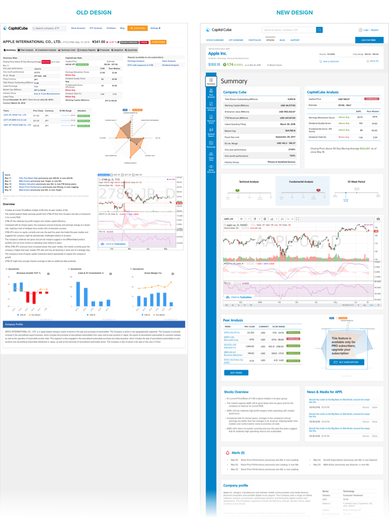
A user could arrive at the Stock Summary page after searching for or navigating to a particular stock. The page needed to bring Stock information, Capital Cube analysis, Peer analysis, Performance data, Related news, Company information together.
The problem:The existing page contained all of this information, but the sections were not organised into a coherent structure. Information felt fragmented and the relationships between different areas were not immediately obvious. The fluid responsive layout also behaved unpredictably on larger screens, affecting the relationship between information across the page.
My approach:
- I introduced a more structured grid system and clearer section boundaries.
- Related information was grouped together within visually distinct areas, making the relationships between different types of financial information easier to understand and scan.
- I also reviewed interaction patterns and iconography. For example, I replaced the existing ‘+’ icon for adding a stock to favourites with a heart icon, using a more familiar convention for saving or favouriting content.
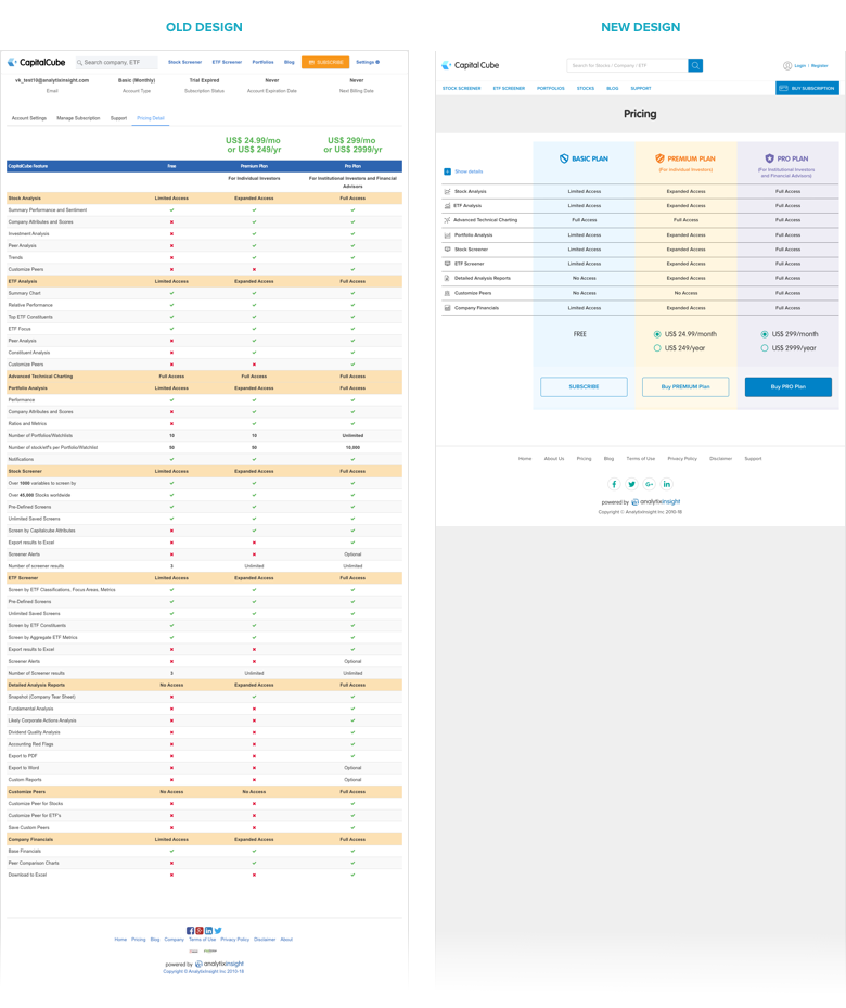
The problem: The pricing page contained a large amount of information, making it difficult to compare plans and understand their differences.
Even when a customer had decided they wanted to upgrade, there was not a sufficiently clear path to the next action.
My approach:
I introduced progressive disclosure, so users could first understand the high-level differences between plans without having to process every feature simultaneously.
Users could then progressively explore individual features when they needed more detail, rather than having to process every feature at once.
Clearer CTAs were also introduced to guide users towards their next step.
From strategy to experience
Bringing the discovery, design exploration and technical considerations together in the final experience.