During my tenure in TSB, I was mainly involved in the TSB-Banco Sabadell migration program. The objective of the program is to migrate the data from Lloyds banking system to Sabadell system. The migration is not a straight forward one, as it is not a like-for-like, because those 2 platforms were not identical.
I was part of a Retail banking digital team responsible for both Public and Secure areas of the site. My responsibilities were more on the Secure site [User account area], however, during the UAT, I was also involved on Public site in suggesting recommendations to create a better user experience.
Because of the non-disclosure, I couldn't provide any screenshots or show any files related to my work in TSB, but I try to give some brief information about each of them.
Tasks overview:
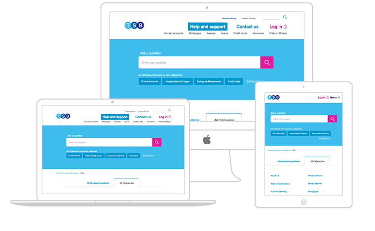
- Handled the UX and UI part of Help & Support solution on the site by liaising with a 3rd party company called Inbenta.
- Liaised with Stakeholders, Project managers and Business analysts in gathering requirements and providing solutions to the development team based on the change requests occurred within the user journeys.
- Created UI specifications for the user journeys of different functionalities within the Secure site using Axure RP software.
- Responsible for updating the style guide for the Internet banking areas.
- A 3rd party company called Inbenta has helped us in building this solution on the site.
- Initially, they have provided a pop-up based solution for the Help section. Because Help & Support the content-heavy area with multiple hierarchies of the content, and pop-ups are not good for SEO purpose, and the user experience will be bad on mobile. Hence we advised business that we need to come up with a different solution.
- I did competitors analysis on the clients for which Inbenta has built this solution, to understand the possibilities from Indenta.
- Performed content audit along with the copy team, to see what content needs to be in there and what needs to go out of the existing Help & Support database.
- Based on the research, I came up with 5 conceptual models in which we have selected one and worked on the Prototype in Axure to take it with the team.


- An external agency Foolproof helped us in setting up the initial style guide based on the grid supplied by SabsIT for Desktop, Tablet and Mobile adaptations.
- Later we picked it in-house and I was responsible for adding necessary components and styles to it as we go along, its a living document.
- This style guide document will be used on both Public and Secure areas of the site.
- For this migration to streamline the process, the User journeys were grouped into different functional blocks.
- Created UI specifications in Axure, for each functional block addressing both Desktop and Mobile version of the site.
- To bring consistency across the Public and Secure site UI specifications, we created Styles, Widget libraries in Axure which will then be used by the public site team.


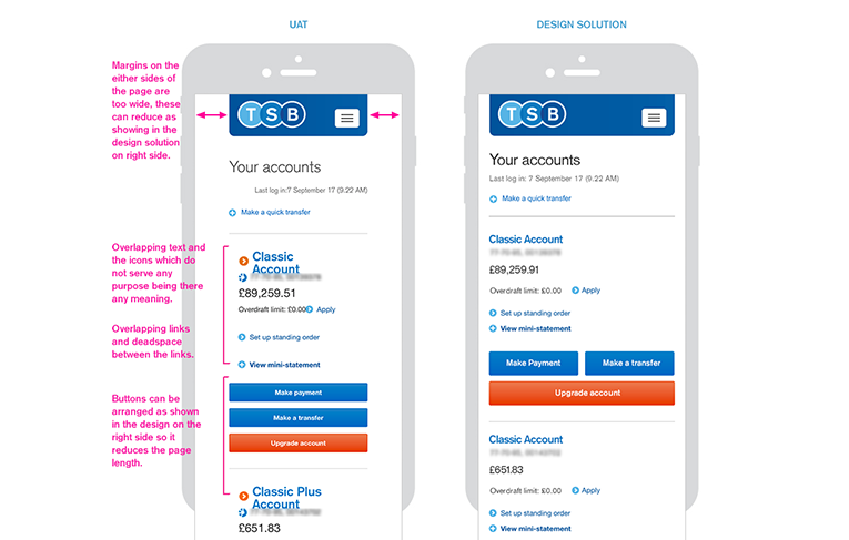
- Involved in mobile secure site UAT-Cycles picked up the important user journeys and have done exploration test to identify the UX/UI issues.
- Attended defect triage calls to discuss the progress of the issues that were raised.
- Used JIRA and FogBugz to raise and prioritise the issues for Phase 1 release and backlogged the issues which can be fixed in subsequent phases as Technical improvements.
