Project brief:
Redesigning the SPRK Music app with a focus on user experience by understanding user insights, improving the onboarding process, enhancing navigation, refining visual design, and continuously testing and iterating.
Here’s a simplified plan:
We have divided the project into two phases considering the timelines:
- Phase 1: Reskin the app while keeping existing functionalities unchanged.
- Phase 2: Add new functionalities from the client's roadmap and incorporate user feedback and UX suggestions from Phase 1.
My responsibilities
- Interacted with the main stakeholder to understand the app's purpose and roadmap.
- Identified user groups (Musicians and Fans) and their respective interactions on the app.
- Created user journeys
- Conducted competitor analysis to grasp current design trends, compiled a mood board with my insights, and opted for a dark theme to enhance the app's modern aesthetic.
- Identified key screens needing simplification.
- Drafted UX suggestions for each screen for future development (Phase 2).
- Coordinated with the offshore tech team to provide assets and ensure the designs are implemented correctly.
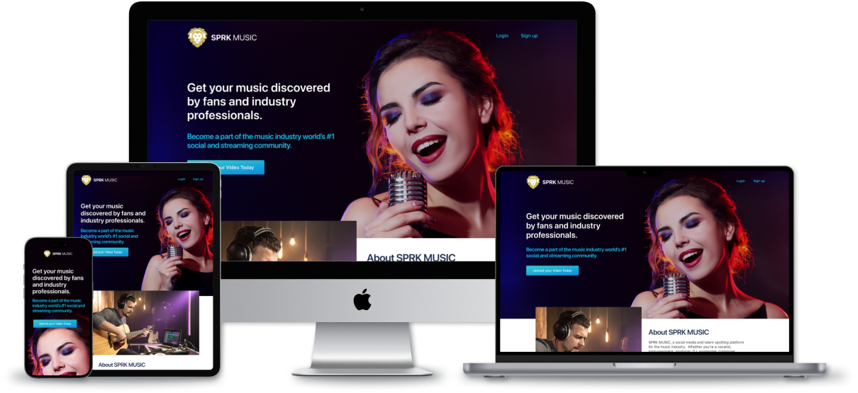
- Designed a responsive website to enhance online presence and improve Google search rankings.
- Designed email templates for user notifications and messages.
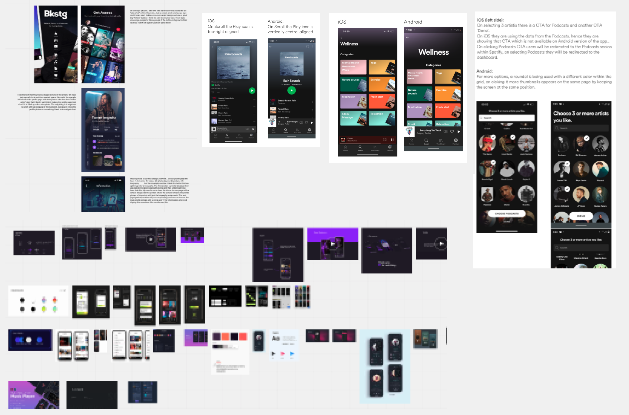
Took screenshots from various music apps to study their UI elements such as icons, fonts, and colors.
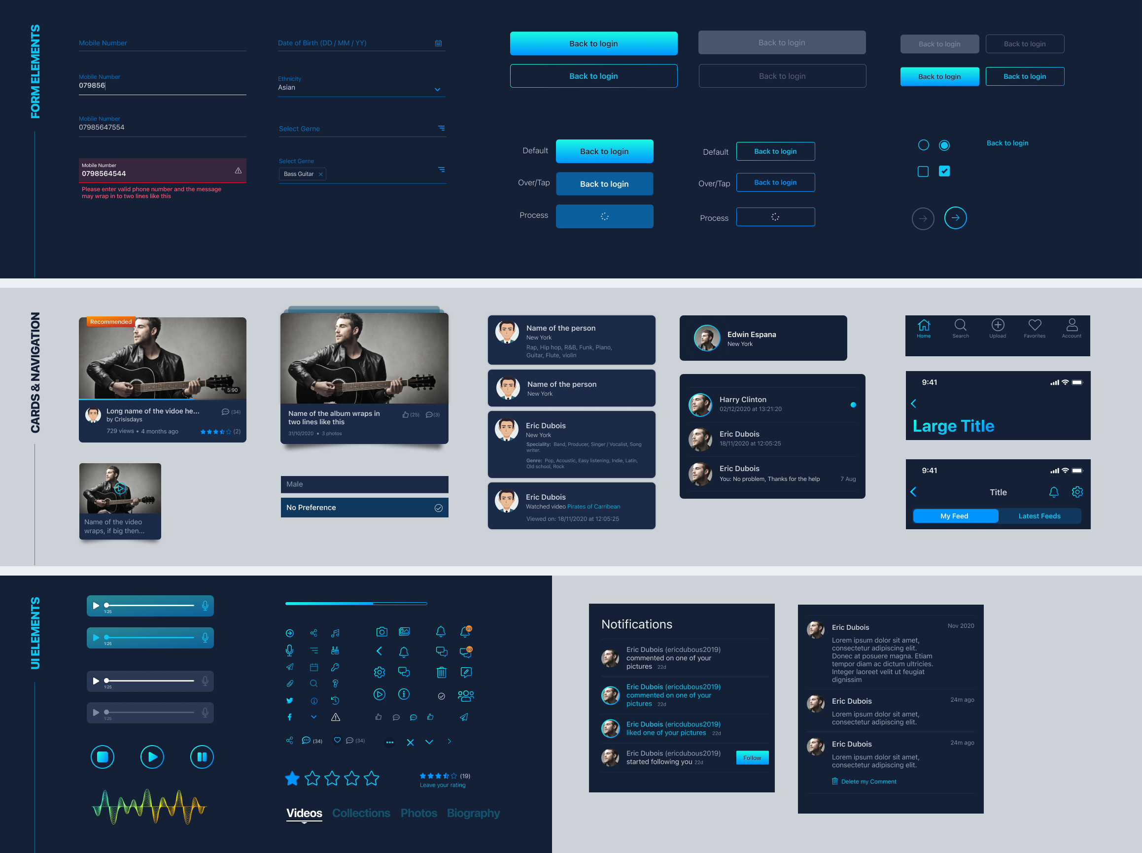
Created components in Figma for design elements such as icons, headers, navigation bars, and form fields, ensuring consistency across the entire app.
App - Phase 1
Here are a few screens to demonstrate the redesigned app
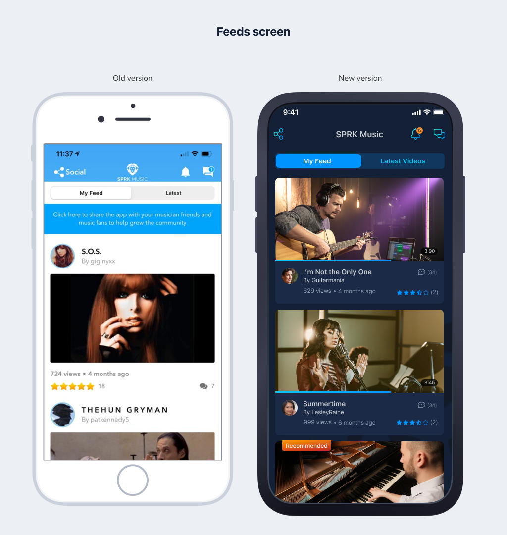
This is the first screen users see upon logging into the app, displaying the latest videos posted by musicians.
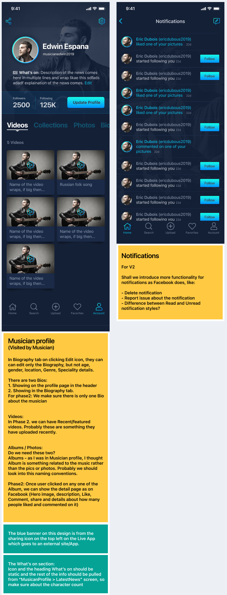
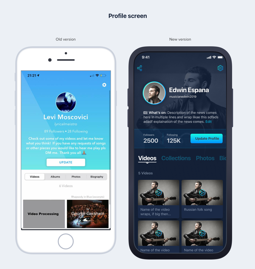
When a fan clicks on a musician's name in one of the videos, they visit the musician's profile screen.
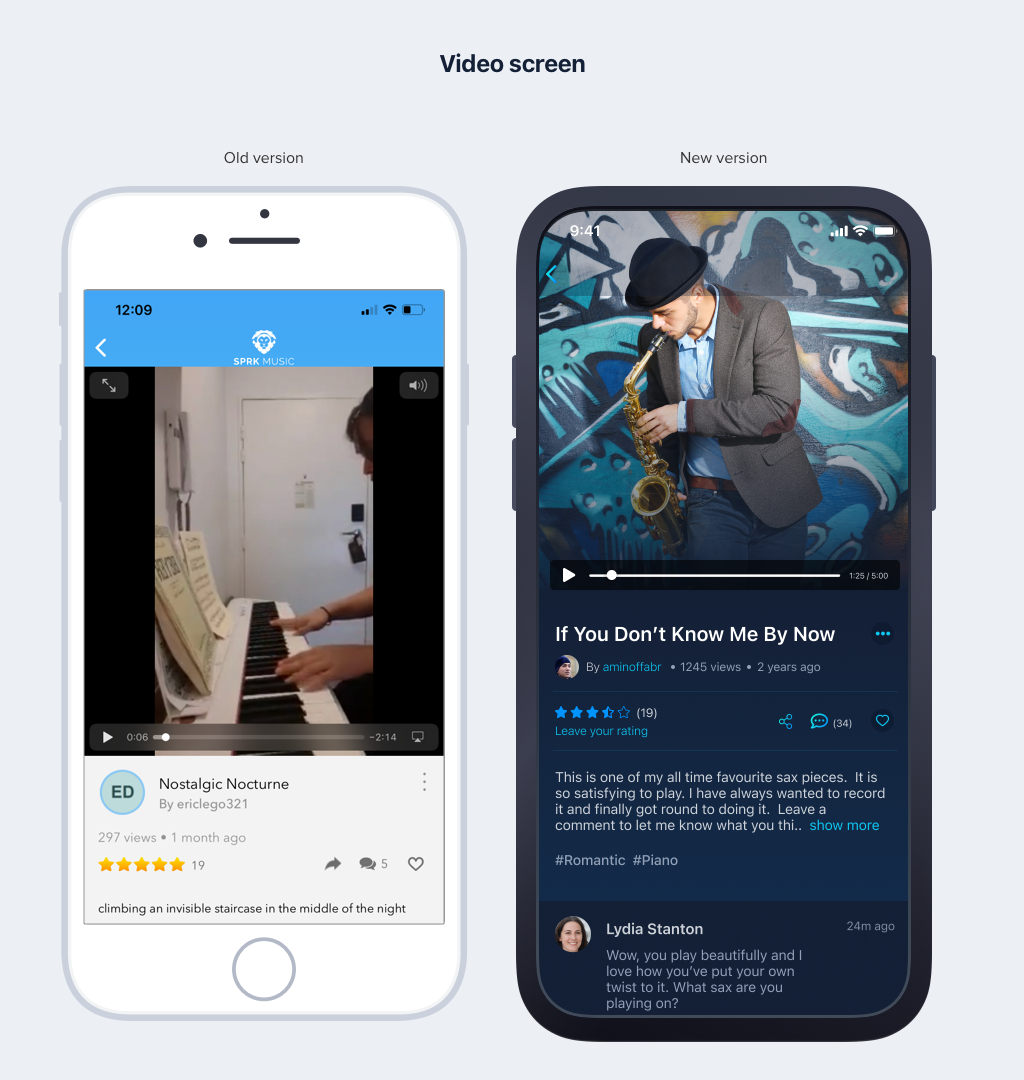
Fans can access this page to view the video and leave comments or ratings
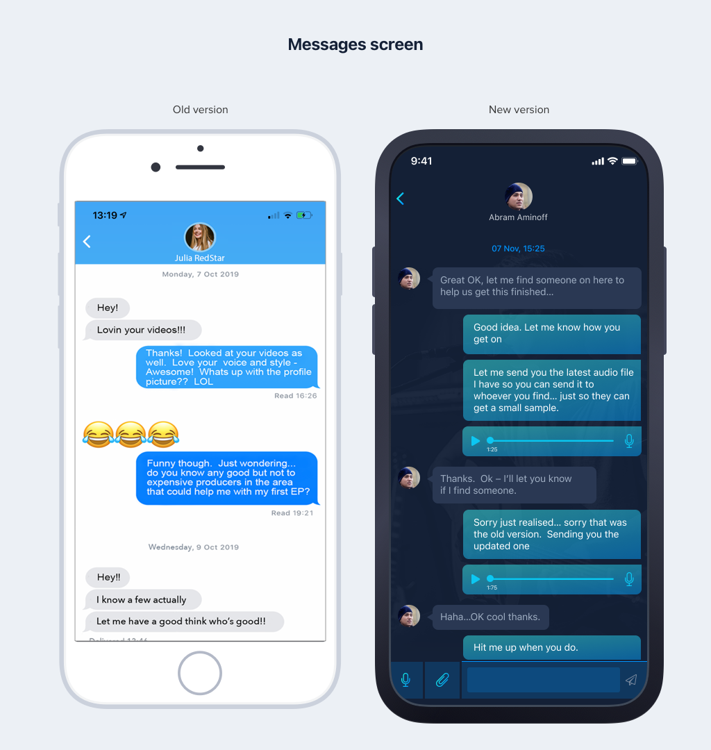
This screen displays conversations between musicians and fans, as well as among members of the app.
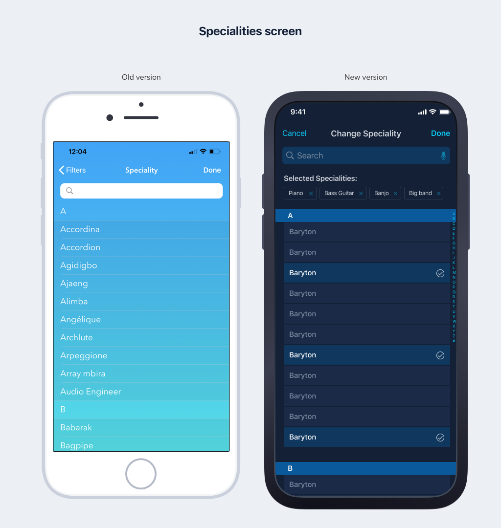
Musicians can select their specialty when creating their profile.
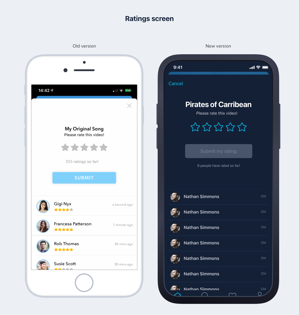
Fans can leave ratings on this screen after watching the music video.
During the design phase, I've used a 'Yellow box' to pose questions for clarification and notes on how this screen will change in Phase 2, providing a heads-up to the development team. The 'Green box' is utilized for instructions to the dev team on how functionalities should be implemented on the screen.
