Overview
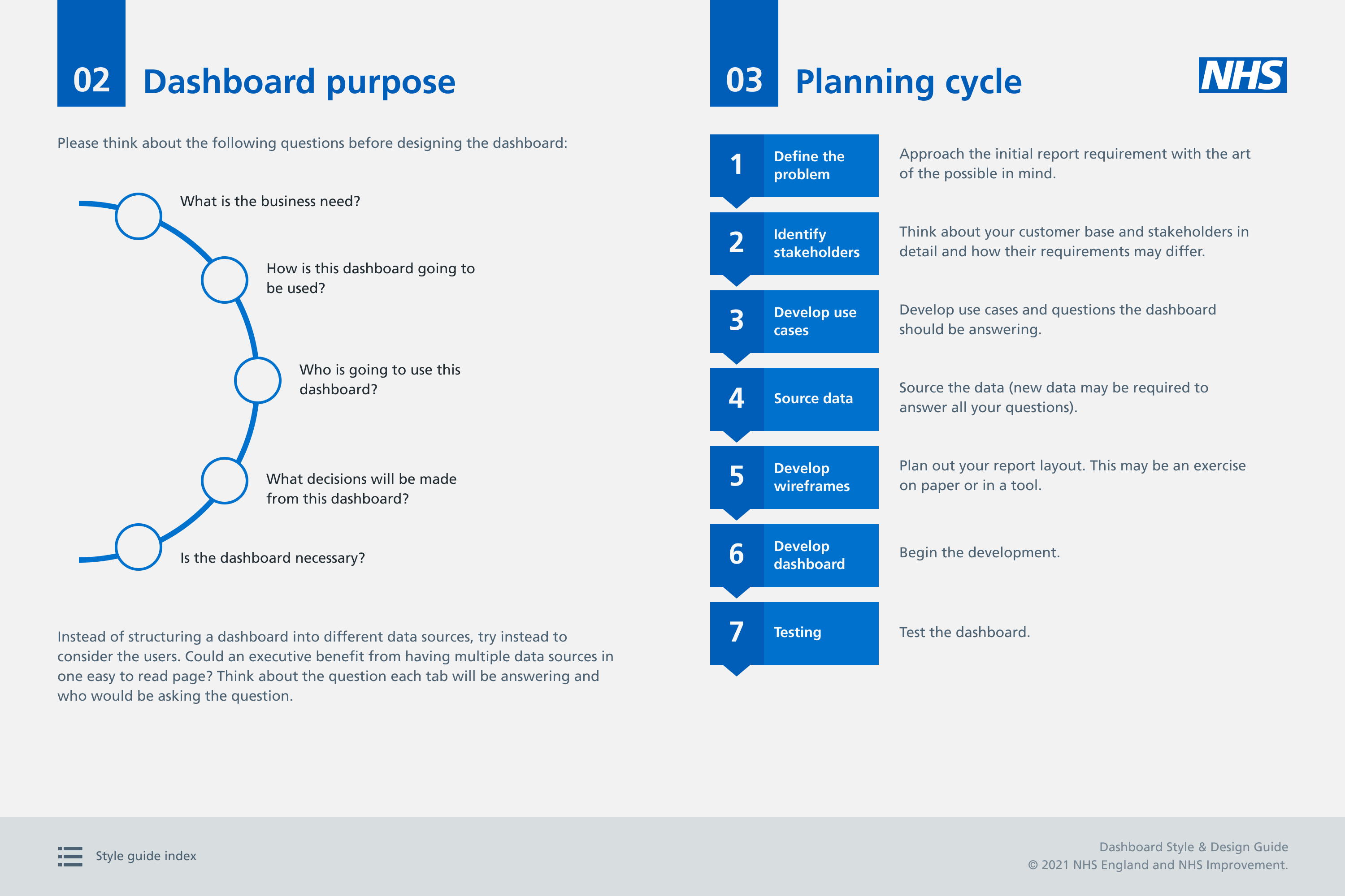
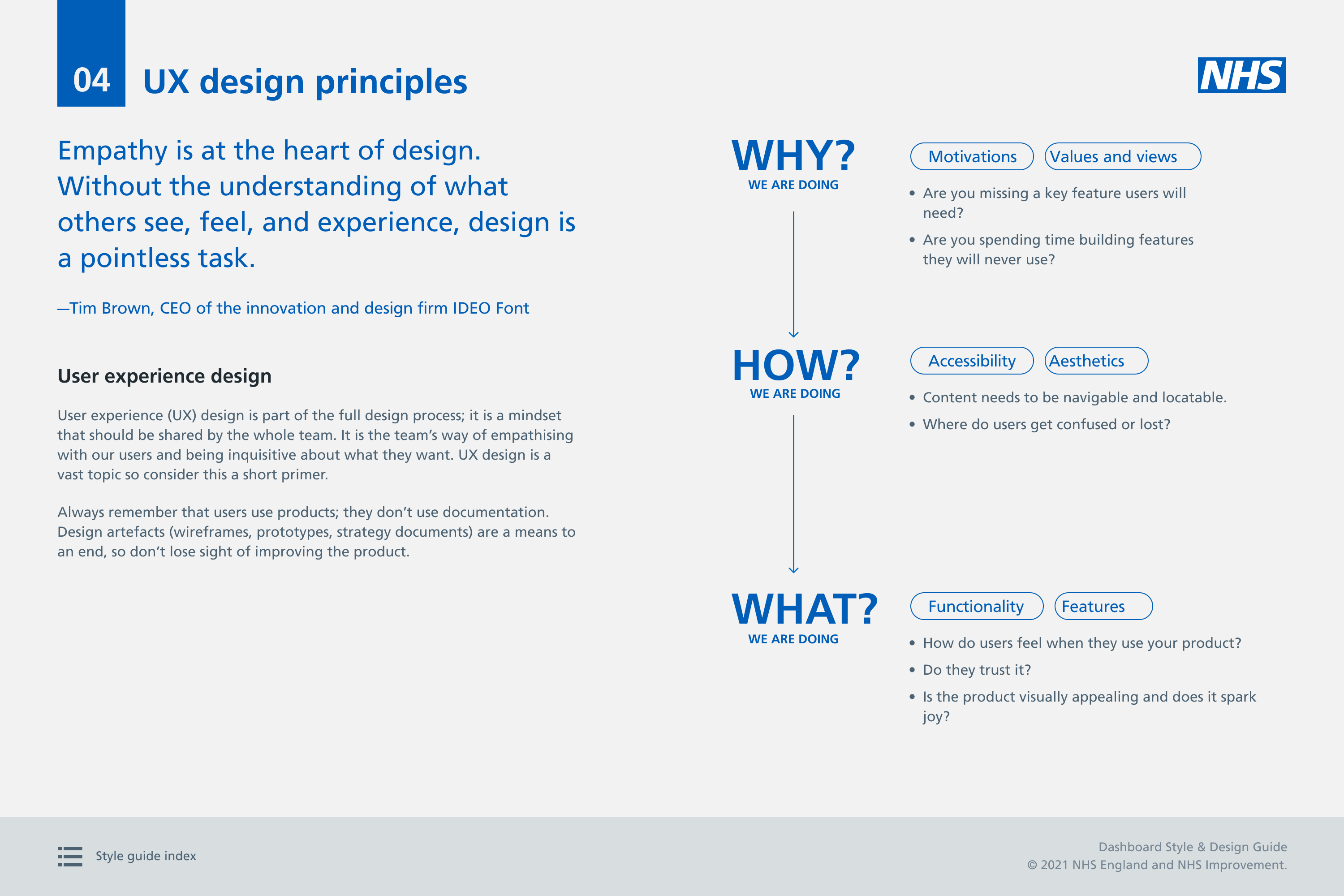
During my time at the NHS, I worked on extending an existing basic style guide specifically for Tableau dashboards. The aim was to create clear and practical design rules for common dashboard components, so that dashboards had a consistent look, feel, and behaviour. This would help users move between different dashboards more easily, without having to learn a new design or interaction pattern each time.
Challenge
Dashboards were mainly designed and built by developers without dedicated design support. As a result, common components such as filters, KPIs, tables, and tooltips looked and behaved differently across dashboards. Users had to adapt to different patterns each time they used a new dashboard.
My approach
I reviewed existing dashboards, identified common components, and worked with developers to define simple, reusable design rules.
The guidance covered:
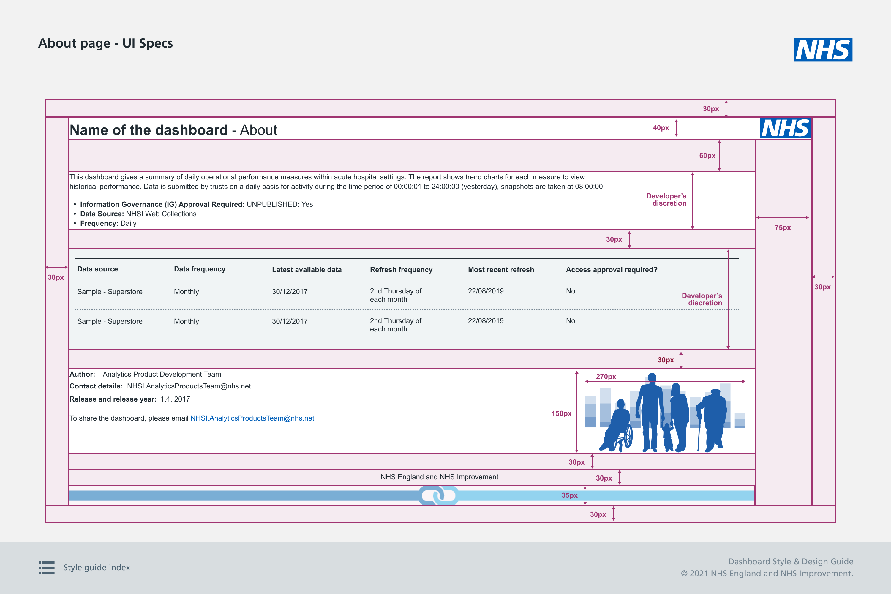
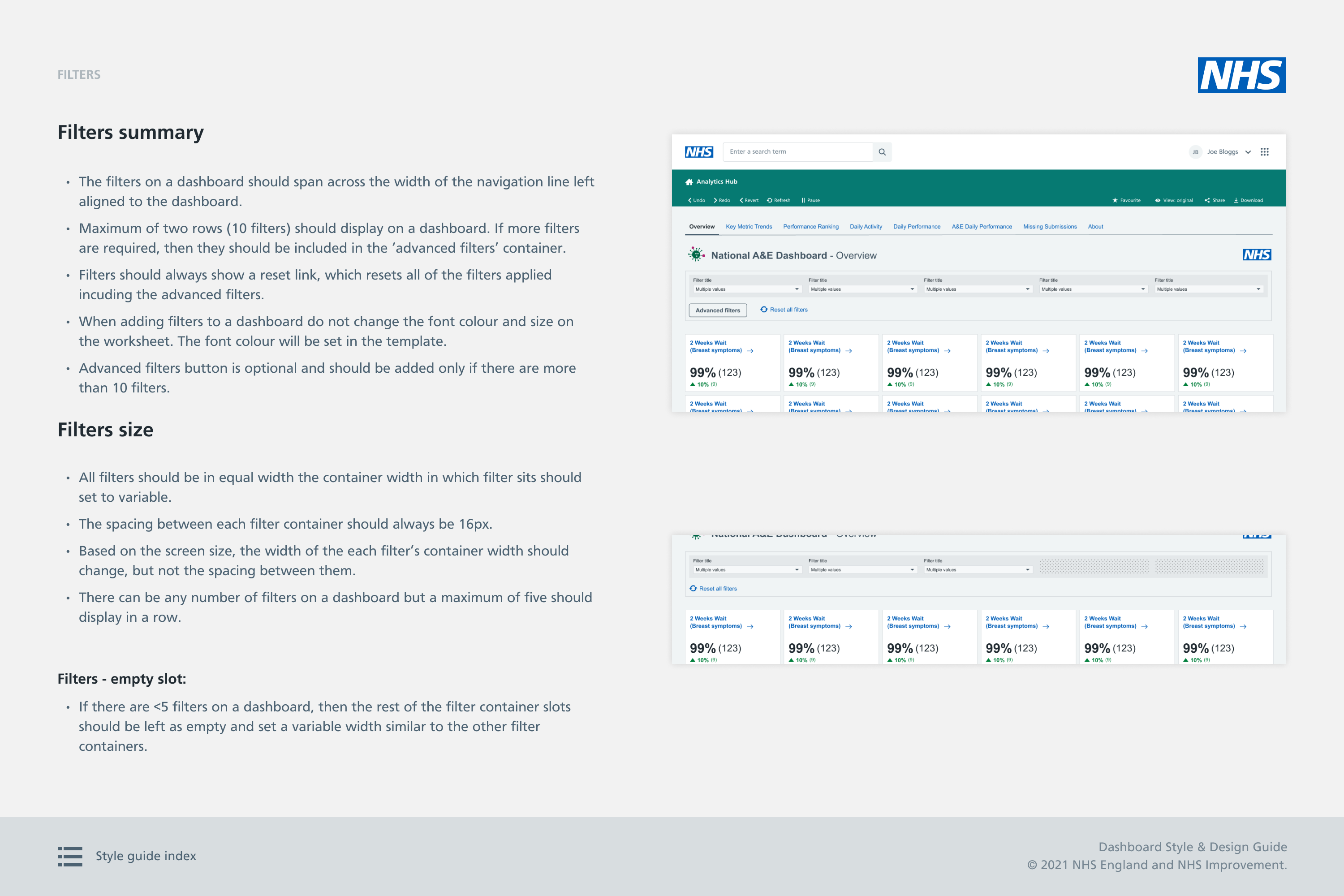
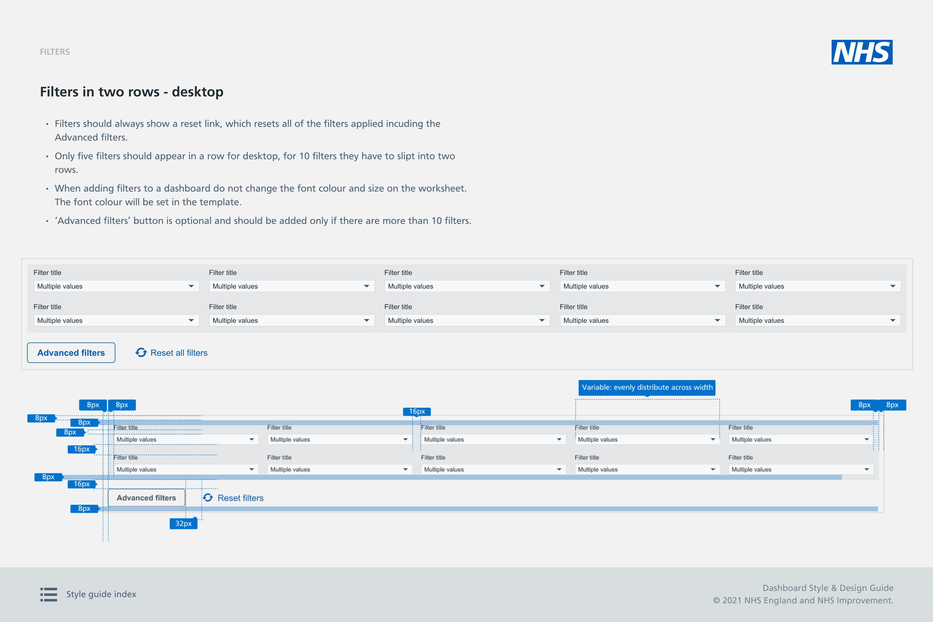
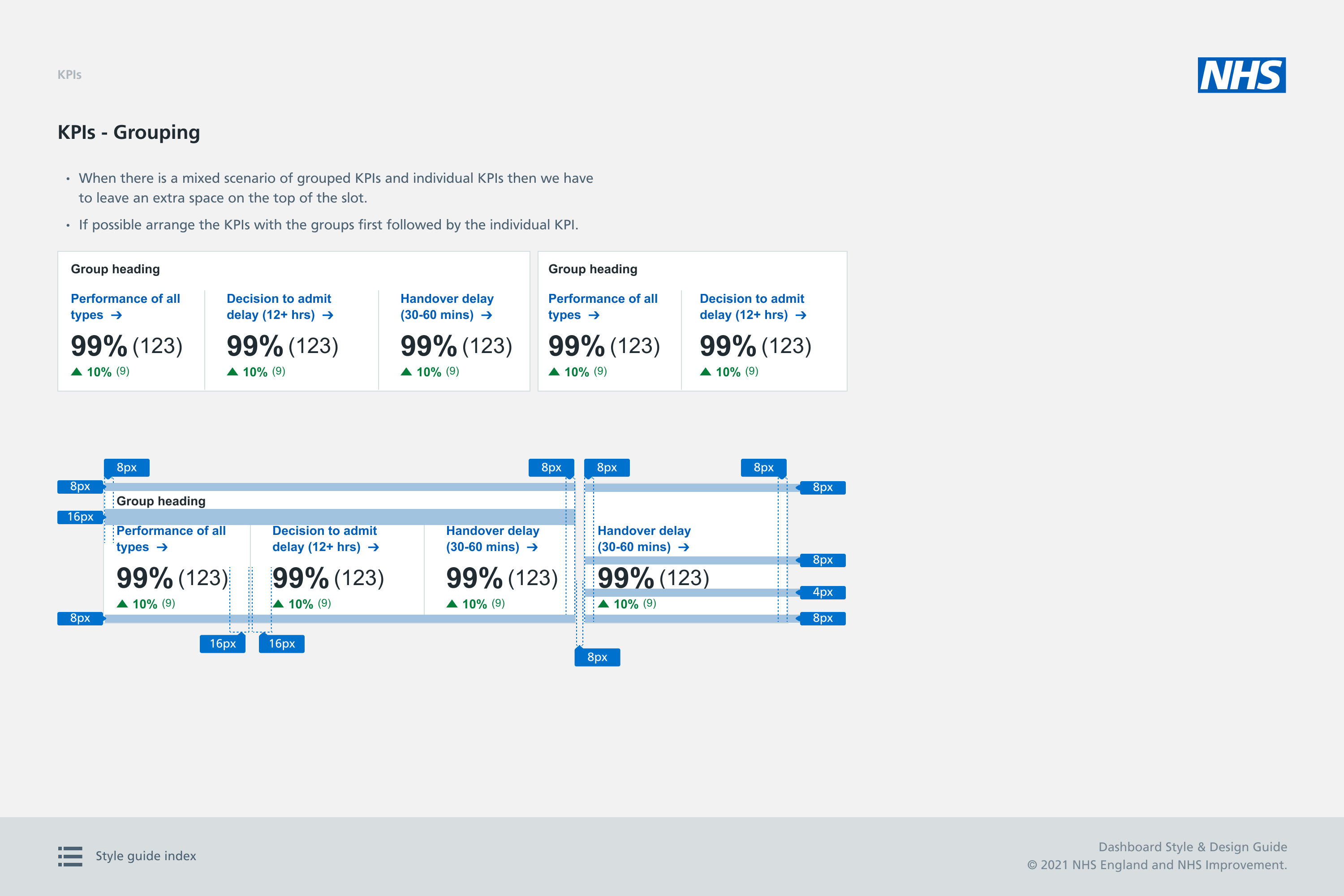
- Components: KPIs, filters, tables, tooltips, and headers
- Behaviour: How components should behave and adapt
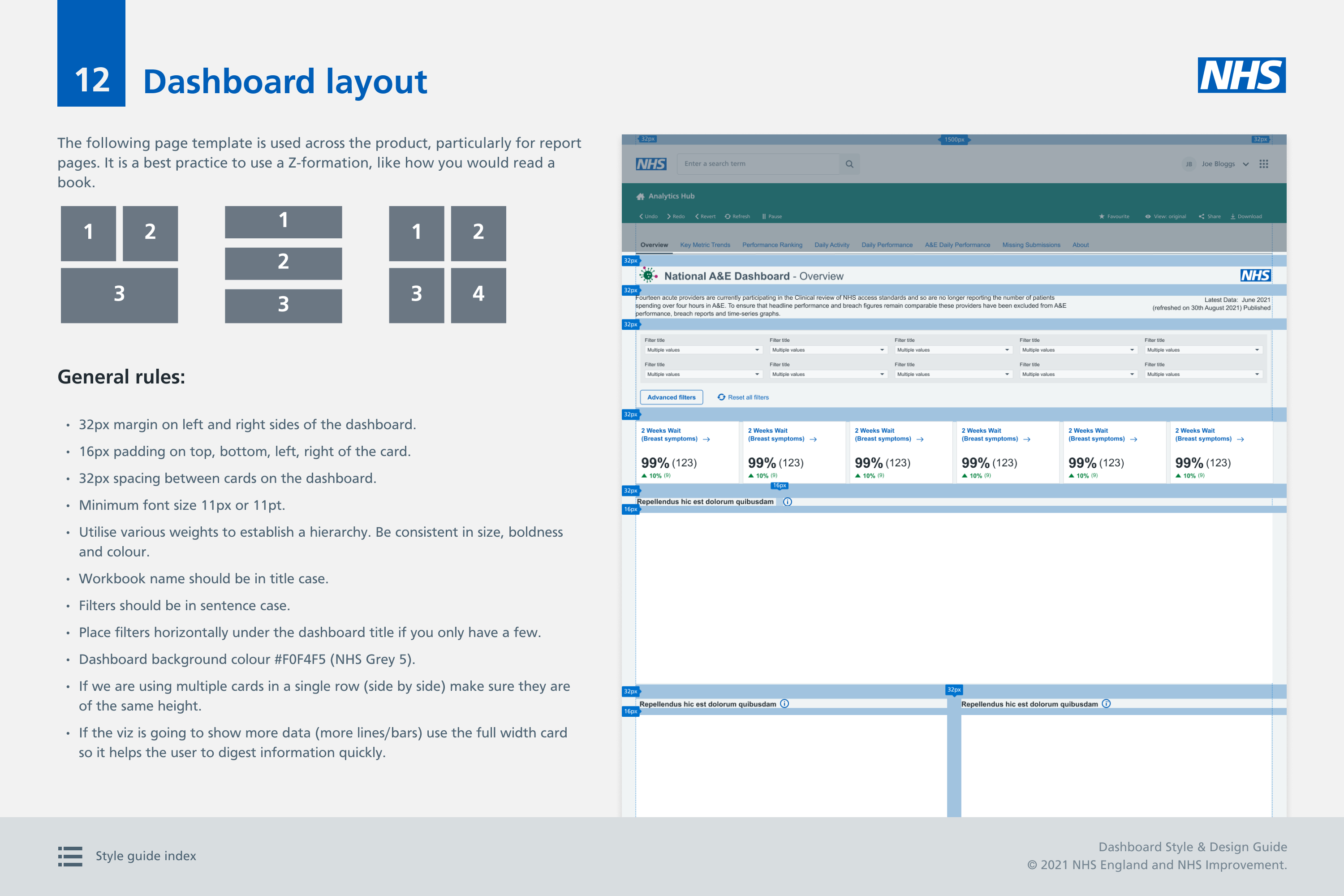
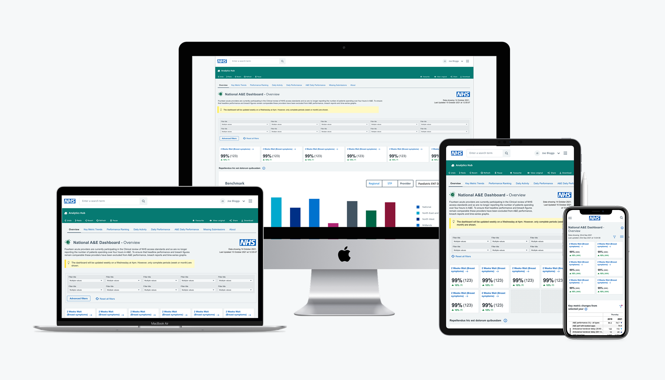
- Layouts: desktop, tablet and mobile considerations
- Accessibility: a colour palette designed to support different types of colour vision deficiency
- Technical feasibility: design decisions aligned with Tableau's capabilities
I presented the guidance to stakeholders and received positive feedback, and this guidance became the shared reference for developers building new Tableau dashboards.
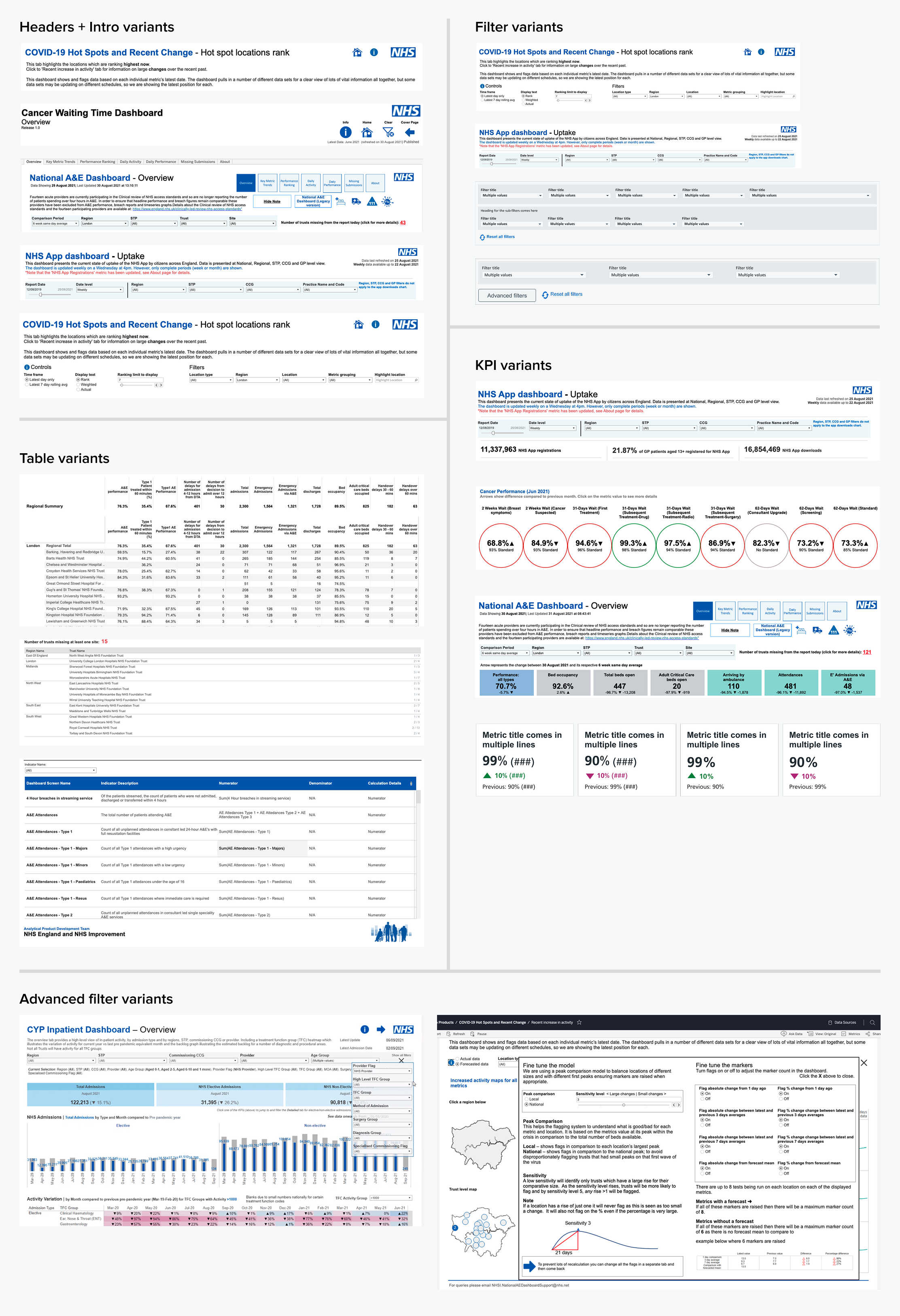
Component analysis
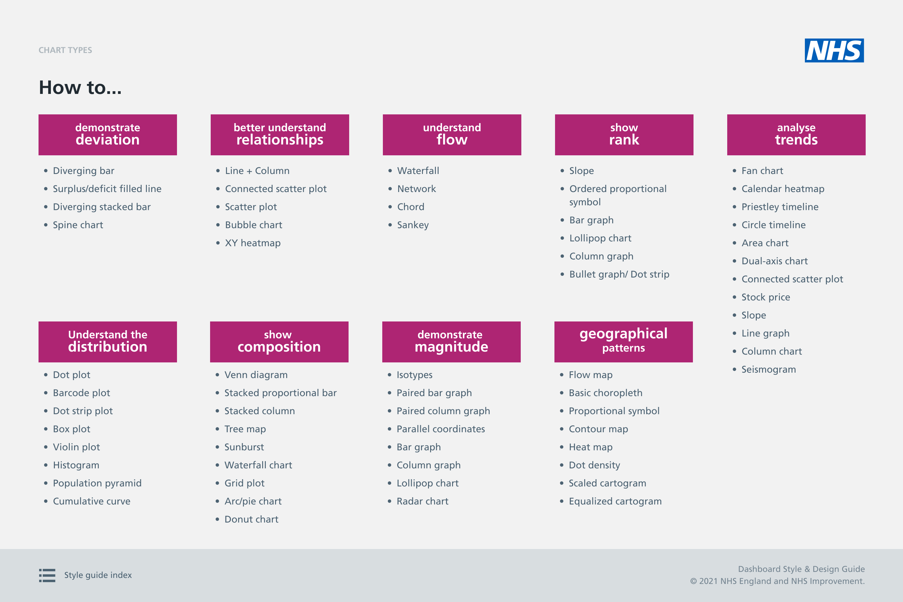
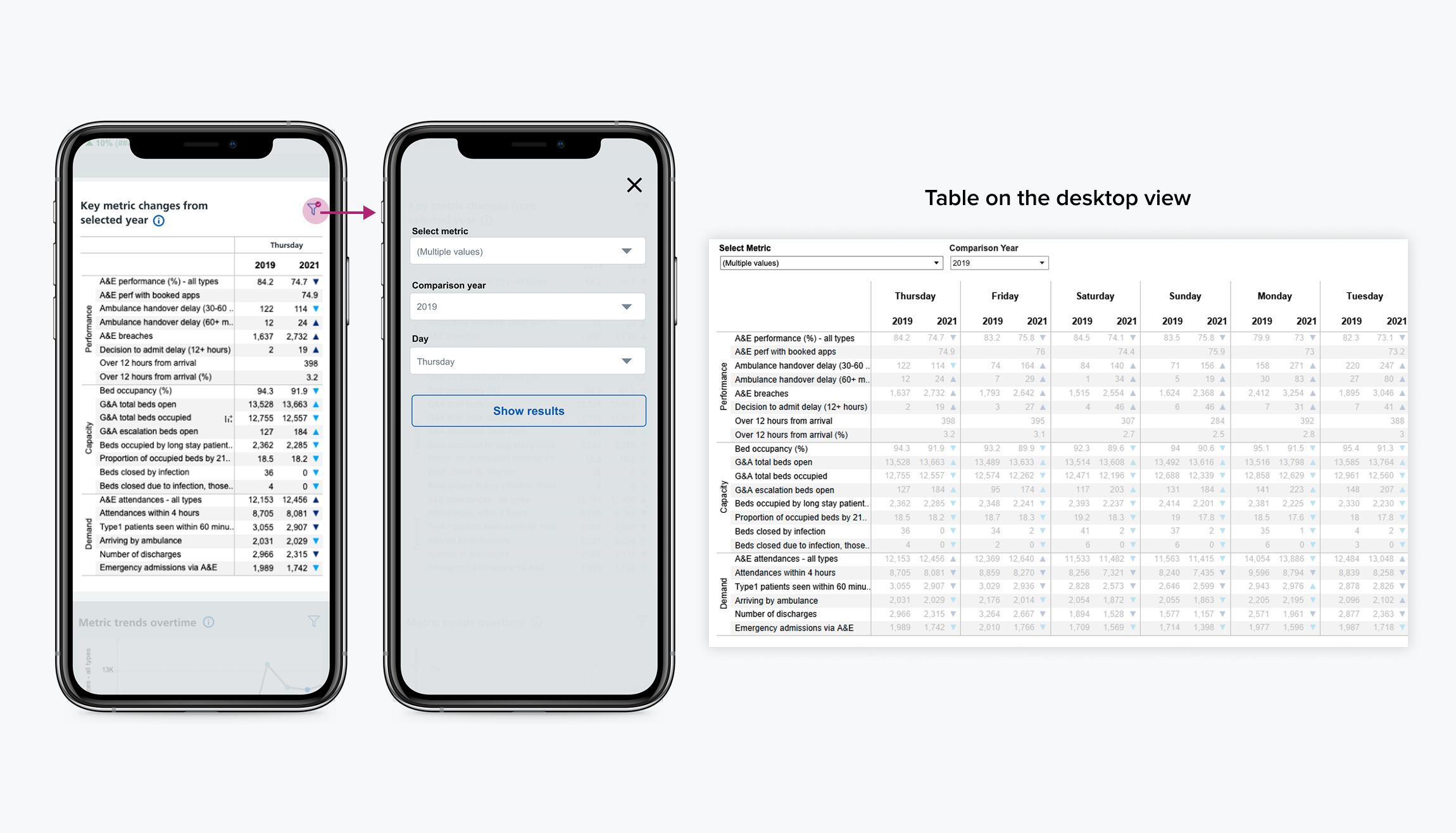
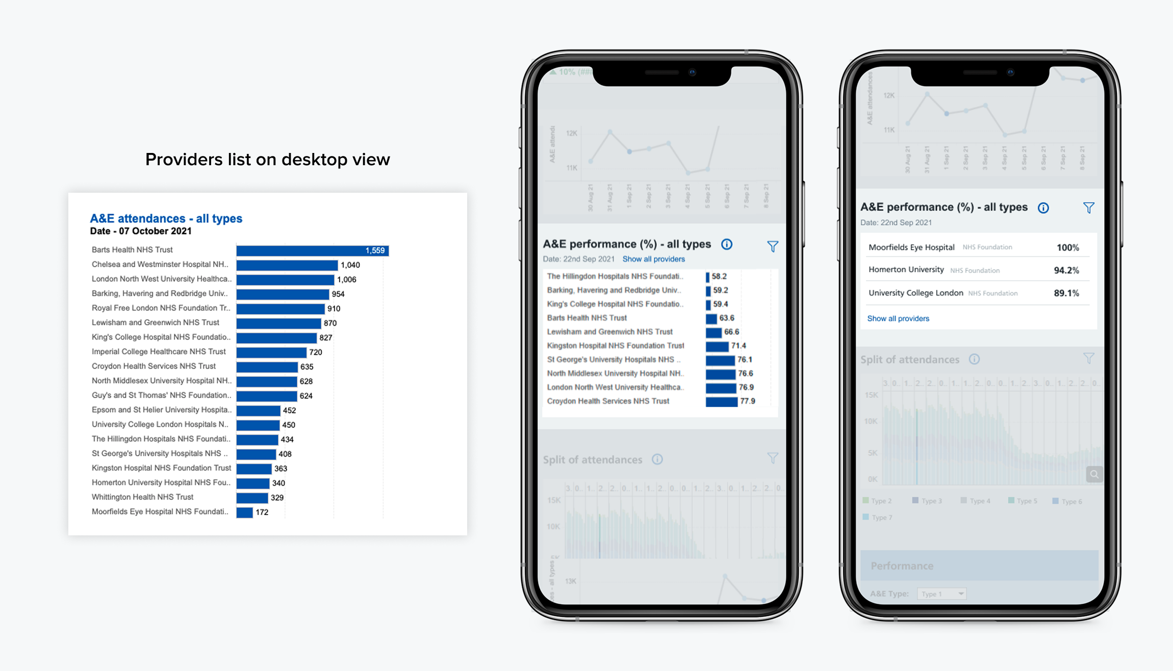
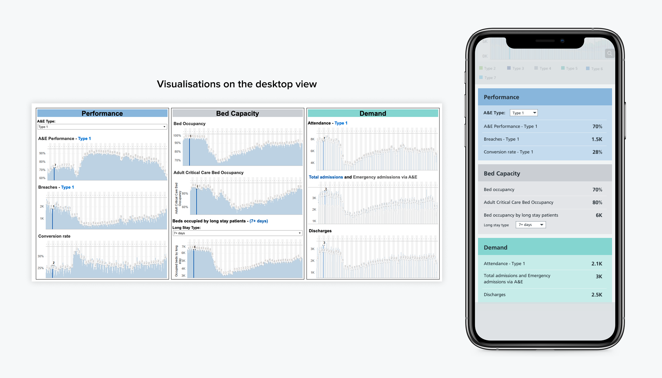
Examples of common components reviewed across existing dashboards.
Accessible colour system
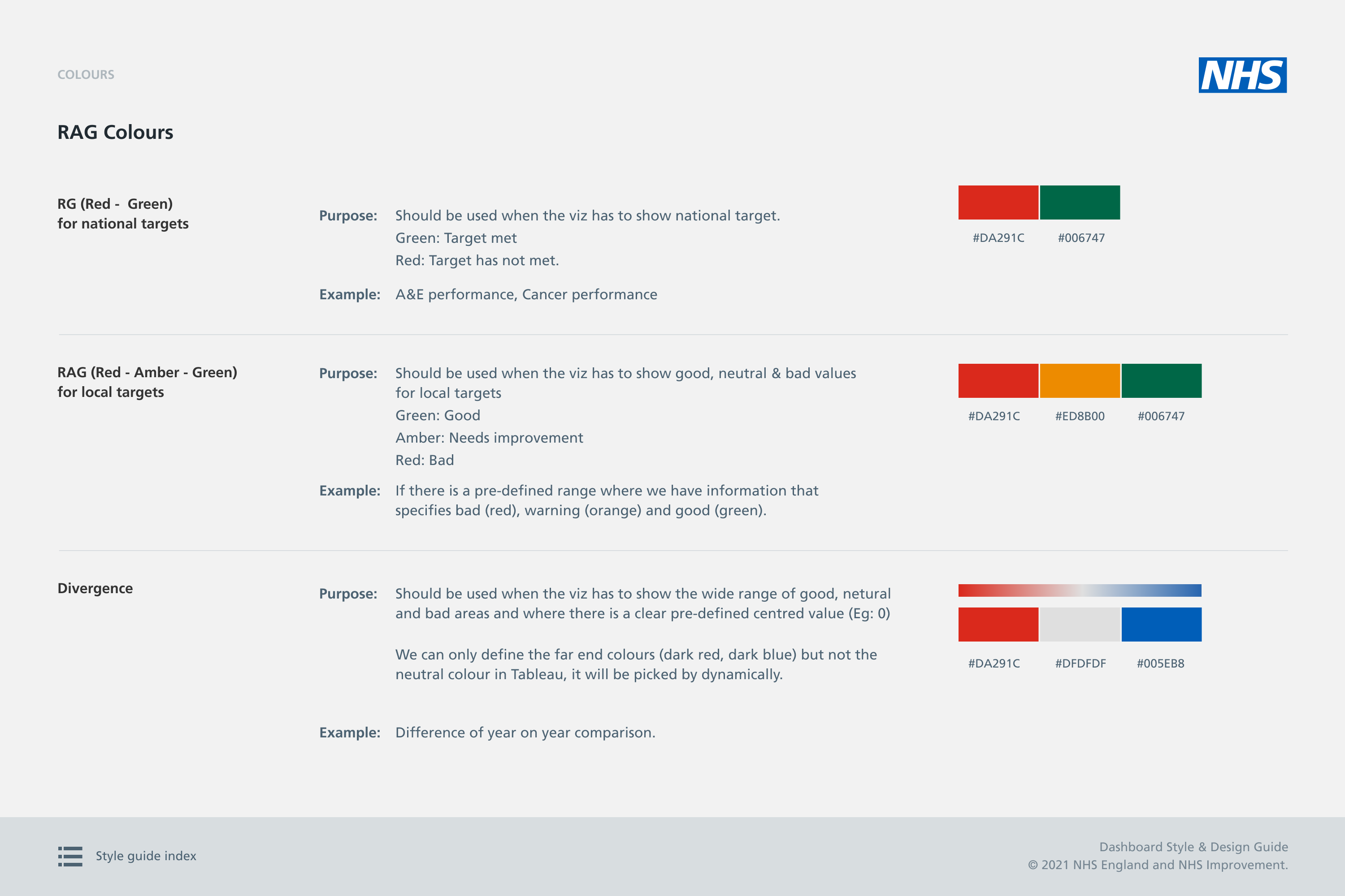
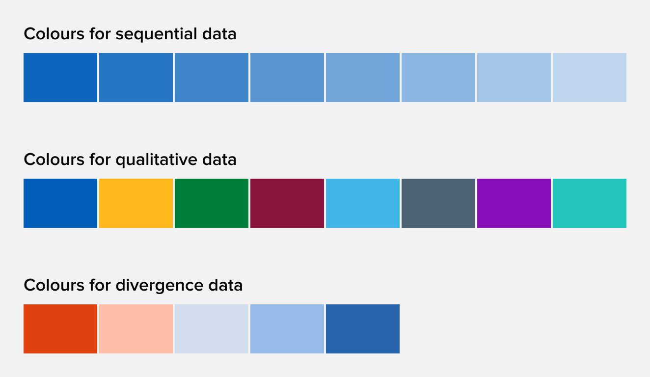
I created an accessible colour palette for NHS dashboards, using the existing NHS colour palette as a baseline.
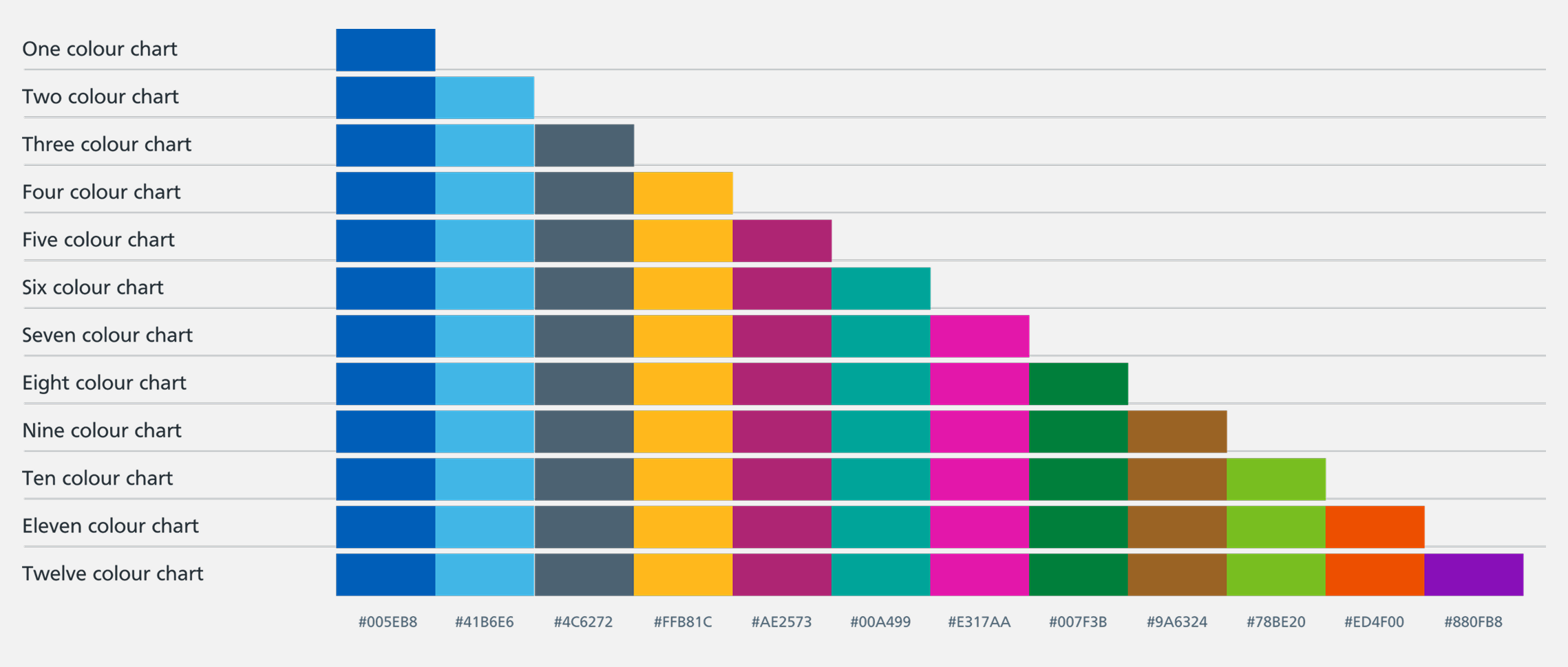
I tested the colours using online accessibility tools to assess how they performed for people with different types of colour vision deficiency.
Based on these findings, I introduced a few additional colours to the palette and defined guidance for their use across dashboard components. The guidance covered:
- Use of colour in charts, including continuous and discrete scales.
- Recommended colour combinations for charts with 1, 2, 3, 4, or 5 measures.
Before
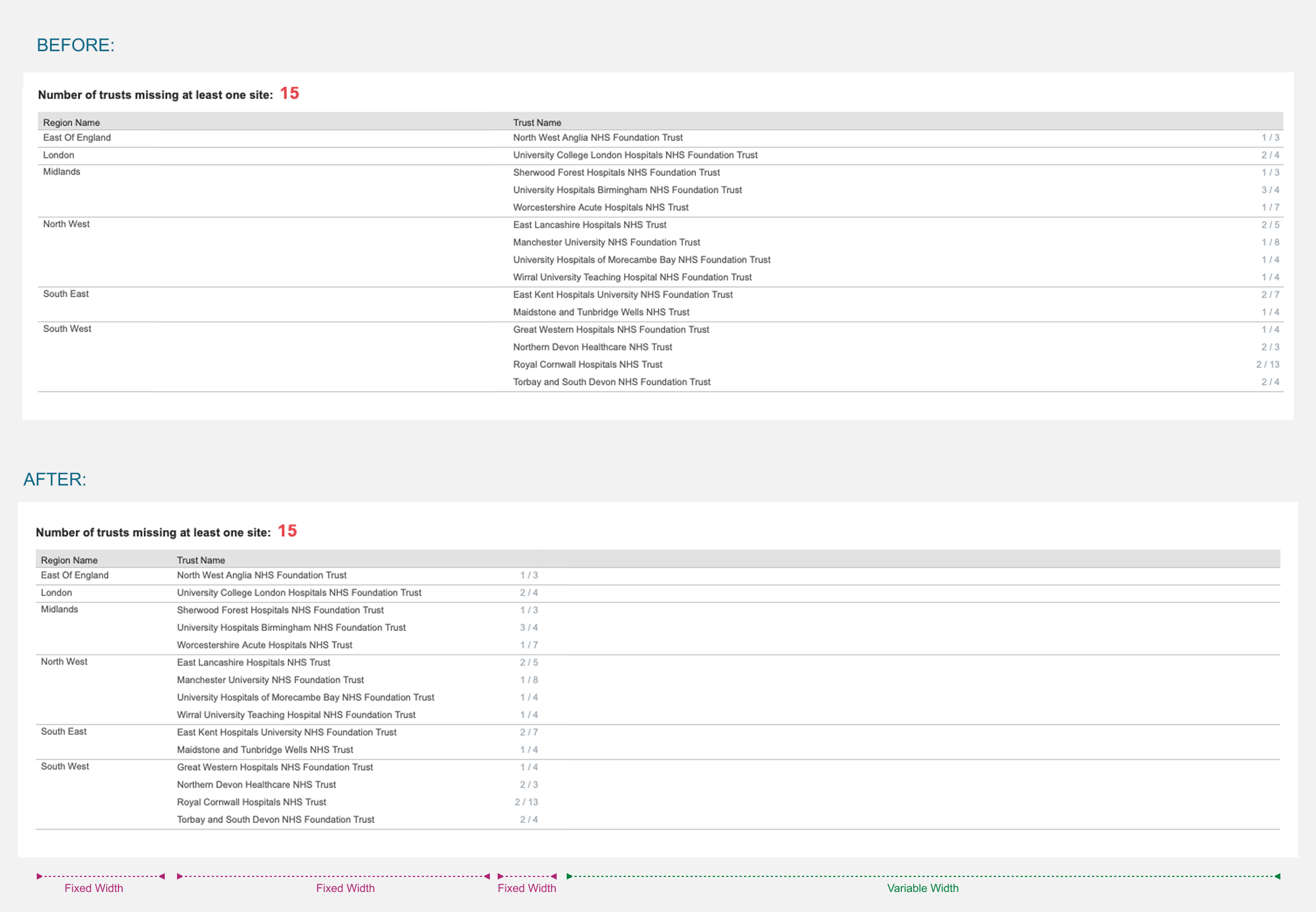
When a table had fewer columns, the fluid layout spread the content across the screen, making it harder for users to compare information.
After
Content columns are kept at a fixed width, while the last column remains flexible. This keeps related information closer together, making the table easier to scan and compare.
Constraints
These constraints were identified at the start of the project and communicated clearly to stakeholders before developing the style guide.
- Designs had to work within what Tableau could realistically support. Some ideal UX patterns could not be implemented exactly as they might be in a traditional web application.
- Developers were responsible for building the dashboards, so the guidance needed to be clear, practical and easy to interpret.
- The work extended an existing NHS style guide, so I needed to work within existing NHS design principles and dashboard patterns.
- Dashboards had different amounts and types of information, so the rules needed to be flexible enough to work across different use cases.
- The guidance needed to balance consistency with enough flexibility for different dashboard needs.
Trade-offs
The key trade-offs we considered when defining and refining the design solutions were:
- Some ideal interaction patterns had to be adapted to work within Tableau's technical constraints.
- The colour palette had to balance visual clarity with accessibility for different types of colour vision deficiency.
- Mobile behaviour was considered in the guidance, but implementation focused on desktop and tablet at that stage.