Project brief:
Based on the insights from the consumer research, business has decided to give control to the user to build their package. We worked on redesigning the Build order tool (BOT) and introduced it much earlier in the sales journey.
My responsibilities
- Facilitated Design sprint.
- Conducted Stakeholder meetings.
- Involved in writing Use cases based on the requirements.
- Created sketches, wireframes and prototypes based on the use cases.
- Written discussion guides and test scripts for the one-to-one user testing with the real customers.
- Planned, arranged and facilitated user testing sessions with prospect.
- Demonstrated my solutions to development and testing teams to get their estimations and to address the challenges.
- Helped testing team in creating and finalising the test scripts based on the Use cases.
- Liaised with Visual designers and Front-end developers to brief them on the scenarios and guide them through the interactions.
- Attended defect triage calls to address and approve the tickets.
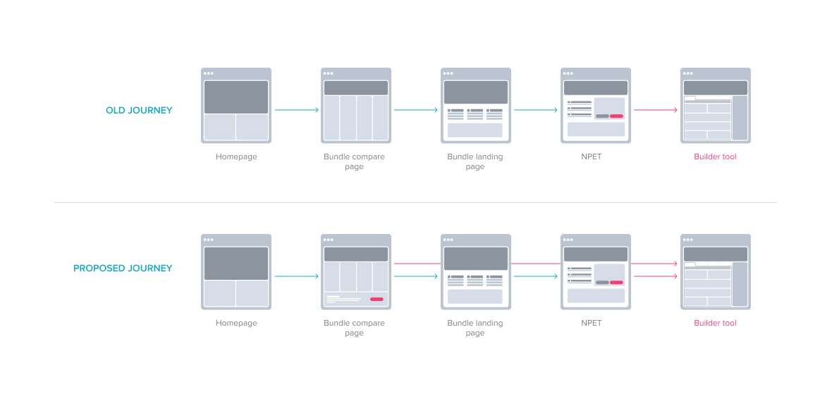
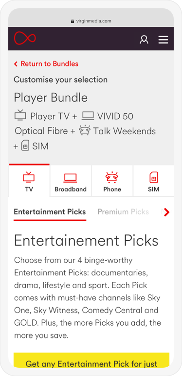
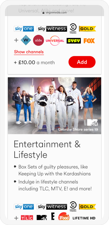
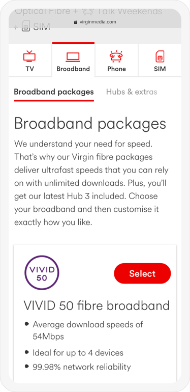
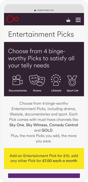
Showing the old and proposed user journeys to the Bundle builder tool page.
Design sprint and its outcome
The processs we have gone through during our Design sprint.
To understand the problem, we have done sort of a user testing with the Stakeholders treating them as our hypothetical users, asked them to perform a few tasks on the existing bundle builder and listed all of their pain points in the purchase journey.
15 stakeholders have been interviewed,
68 pain points were identified.

Identified pain points were themed and addressed those themes using 5 modules (Header, Product navigation, Category navigation, Content cards, Basket summary).
47 sketches were created for both mobile & desktop.
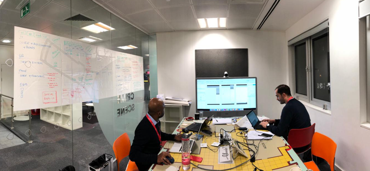
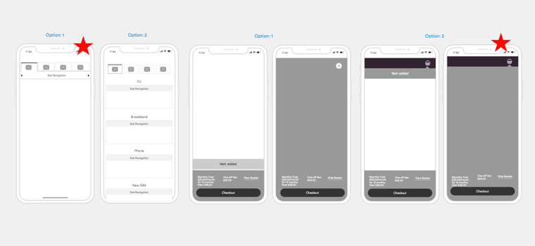
Reviewed and validated sketches with Technology, Commercial and Marketing teams considering the Pros and Cons of each option. Decided on which ones have the best chance of achieving a long-term goal.
2 voting sessions held,
17 votes received.
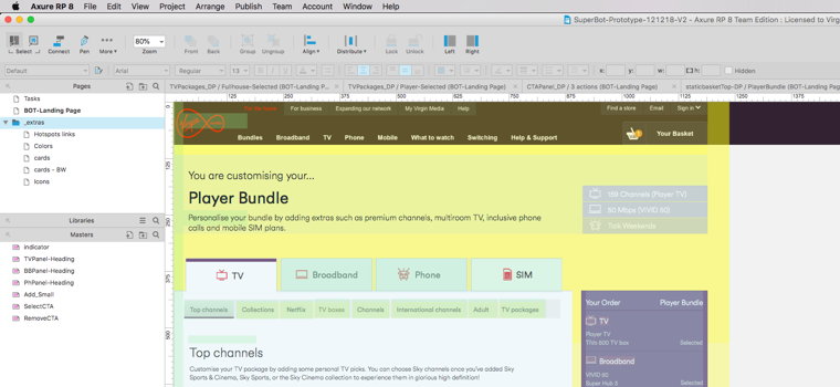
Decided on the level of fidelity to build a prototype and agreed on the tasks that need to be tested with the user.
1 prototype created,
10 prospects recruited.
Performed User testing with 10 candidates of different age groups and produced a report.
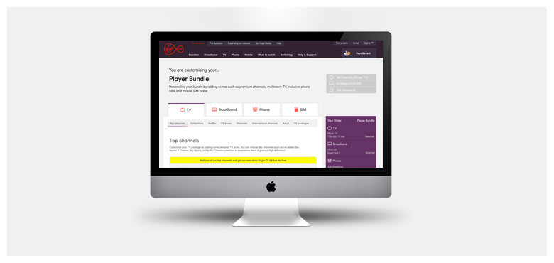
Old design Vs New design
Below is the layout for the Old Vs New BOT pagewe have designed.
Improvements in the new design:
- Navigation: We made it clear about the product categories, sub-categories along with their add-ons.
- Order summary: Clearly showing the items that have been added to the basket.
- Content cards: Improved the presentation of information within the cards.

Final Output
