Project brief:
I was commissioned by a company called ‘Capital Cube’ based in Canada to help them in redesigning their responsive website - www.capitalcube.com to improve the Sign-up and Subscription rate of their customers.
Challenge:
- Limited insights about their website.
- Existing backend code can be changed only to a certain extent. Not enough resource to work on their content strategy. Eg: To decide what level of information is necessary to have it on the site.
My responsibilities
- Created Sitemap by understanding the site structure.
- Interviewed stakeholders, marketing people to understand their requirements.
- Liaised with Capital Cube development team to understand their technical limitations and how they would expect to receive the handover.
- Responsible for doing the competitor analysis, defining the interaction design and creating visual designs.
- Tried to understand the business, features, and terminology.
- Looked at their competitors and few other websites to understand how they are showcasing the complex data on their websites especially on mobile.
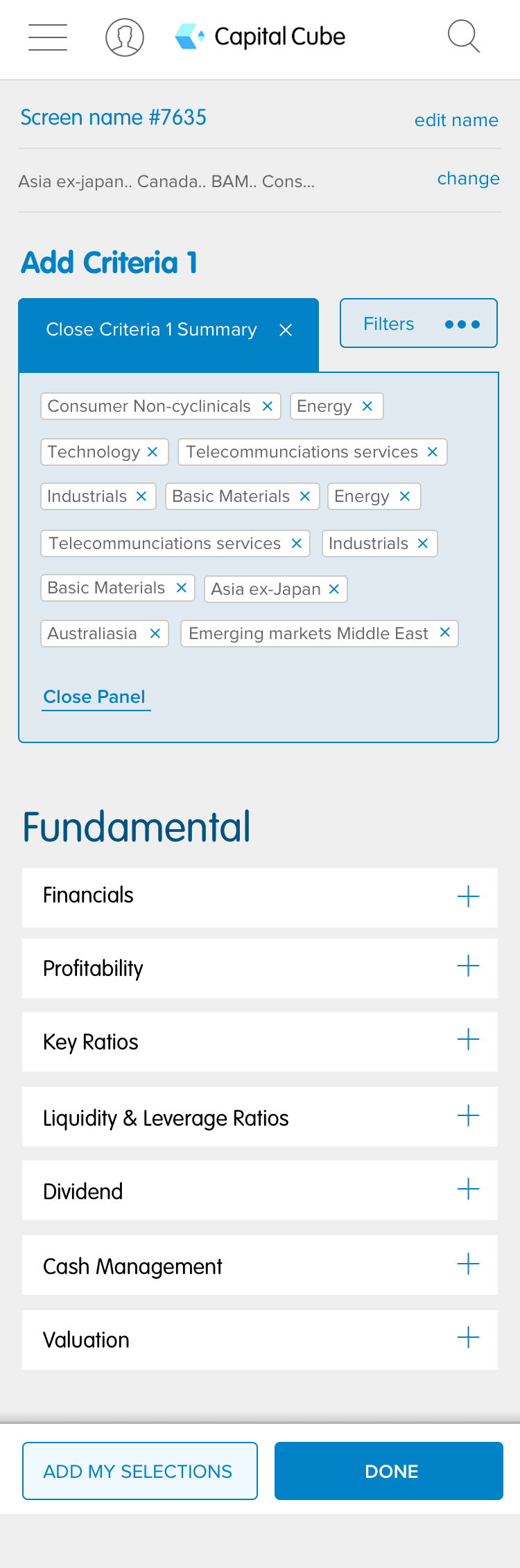
- This website has so much data to be presented to the customers, it was a big challenge about how to make the hidden data evident to customers in a few areas.
- cause of the no and limited insights, we started doing the hypothesis designs for Stock screeners and EFT screeners.
- I have come up with various options to show the complex data in a tabular format, but as they don’t want to change the existing code vastly, we got to go with an easily implementable option.
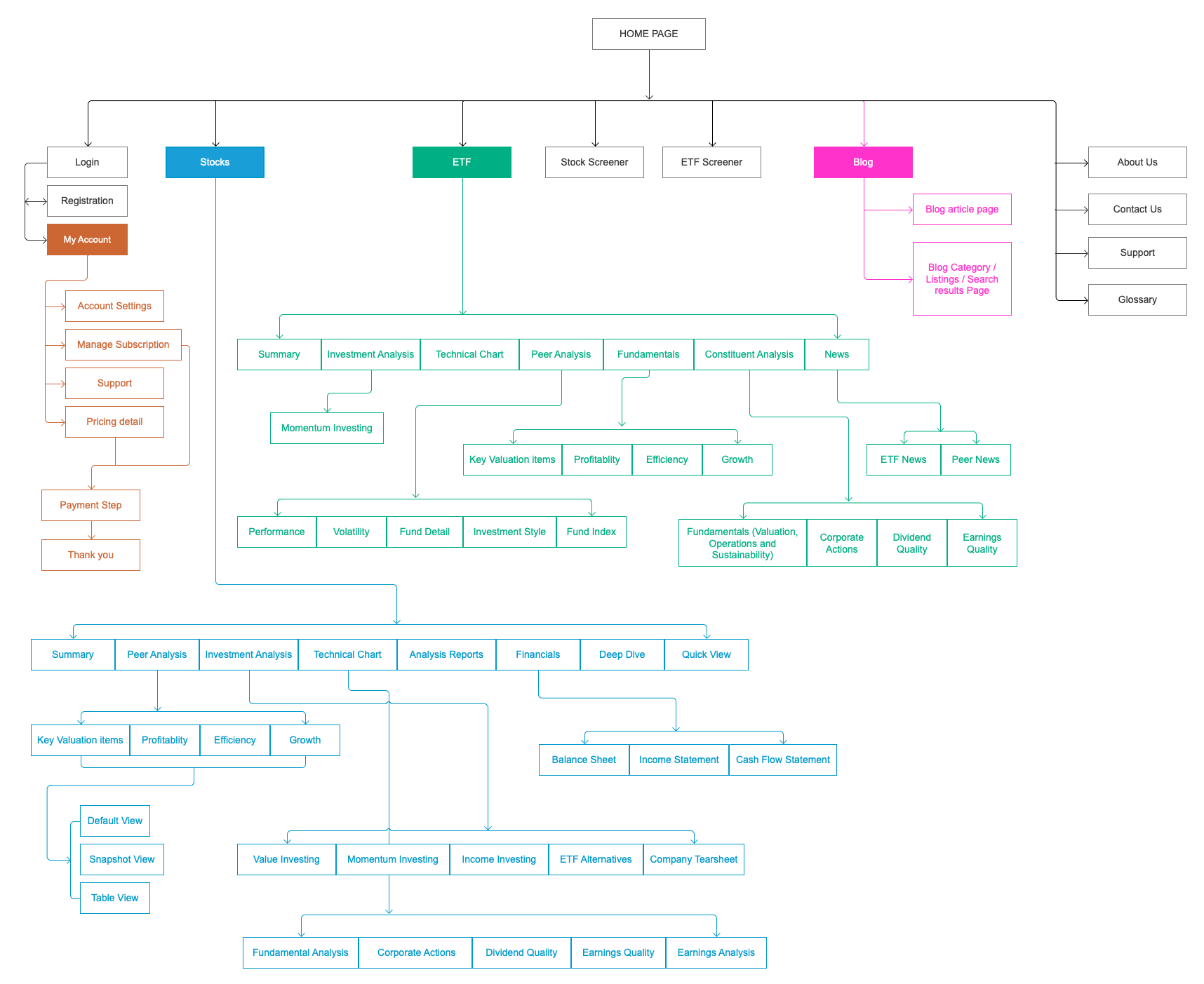
As a part of research, audited the whole site and created a sitemap to understand the site structure, and to analyse if there are any pages which were not shown in the navigation.
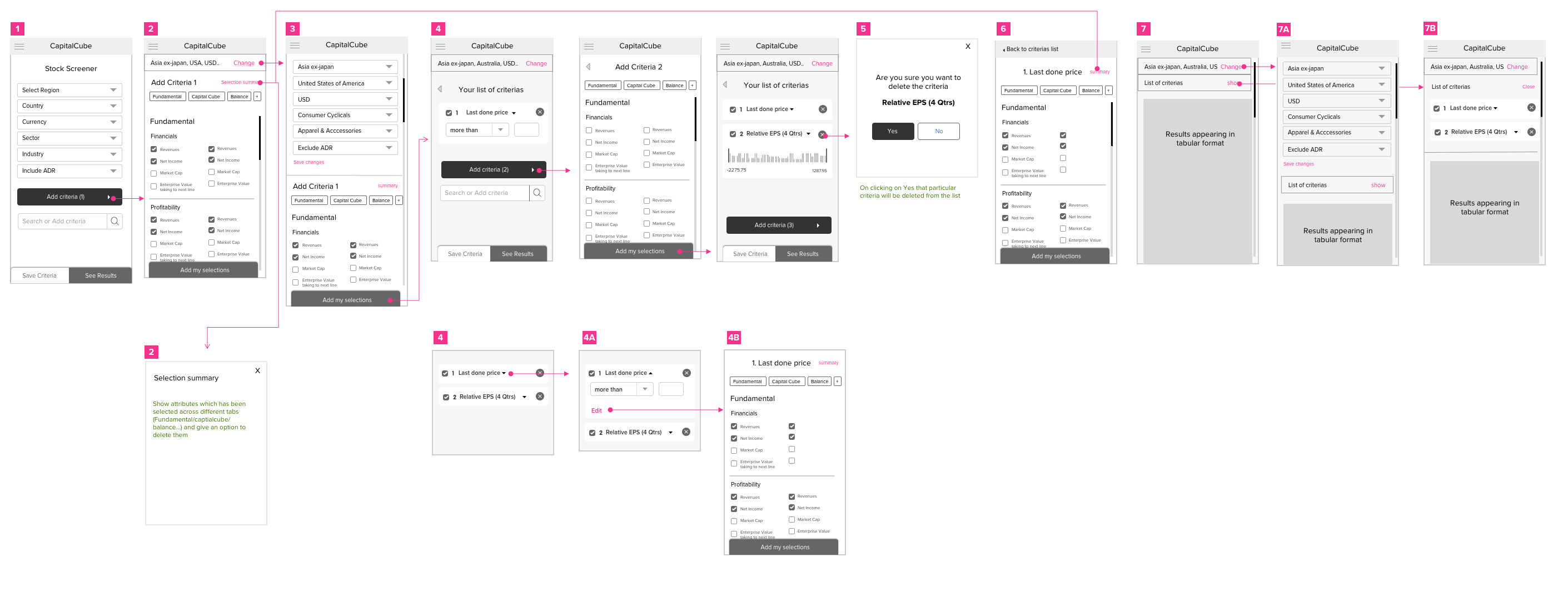
Series of steps addressing a very complex journey for the mobile version of the site.
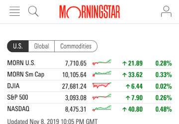
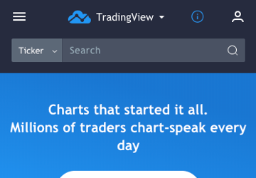
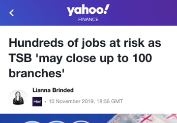
Competitor analysis
LD Micro, Morning Star, Share Investor, TradingView, Yahoo finance, Zacks and few other stock related website to understand how they are presenting the complex information on their site.


Old design Vs New design
Listed below are the important pages of the site showing the difference before and after the redesign.
Old design
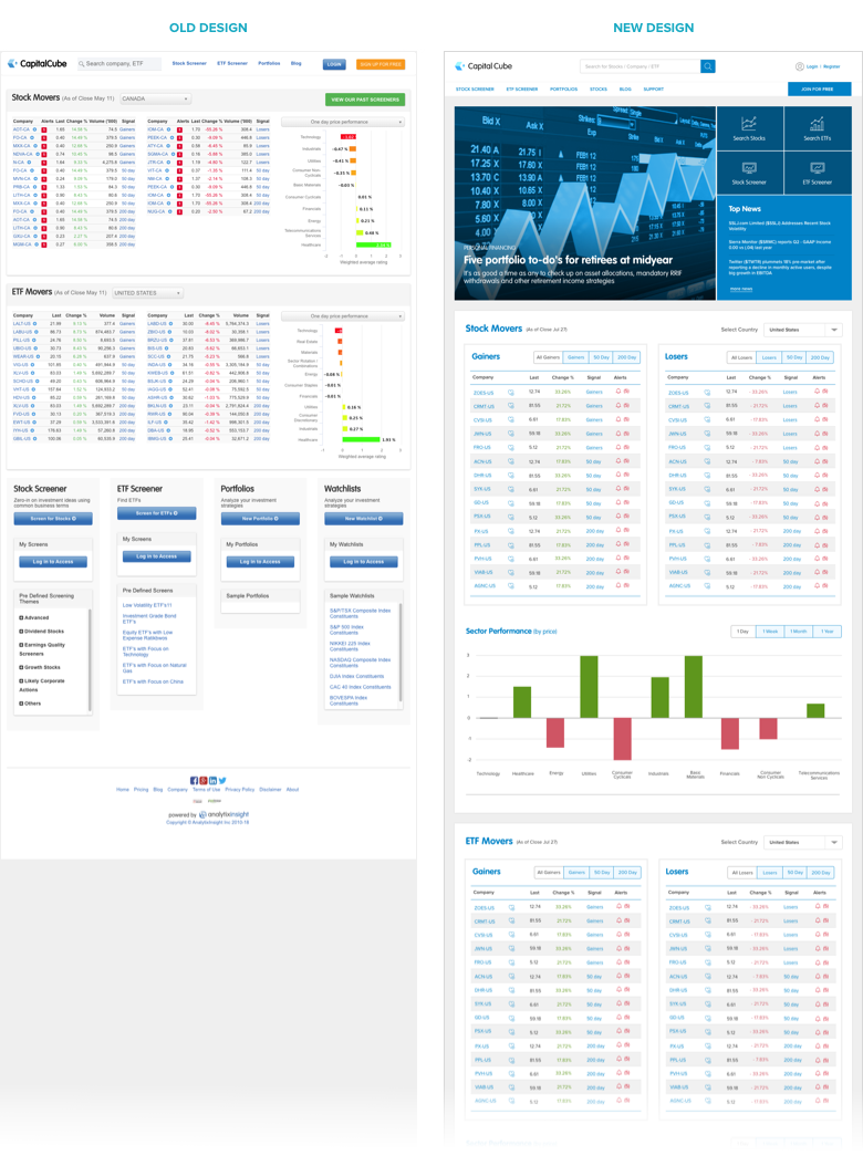
- The design of this page is dated.
- The brand identity was missing and it doesn't look like a landing page for the user who lands on the website for the first time.
- Hard to scan the page as there is no visual hierarchy and strong categorisation between the sections and as well the font-size is very small.
- Created a strong visualisation on the page with the header.
- Presented links for the easy access to the main important areas of the site (boxes on the right-hand side of the banner).
- Made clear categorisation of the data, to make it easy for the users to scan the information on the page.
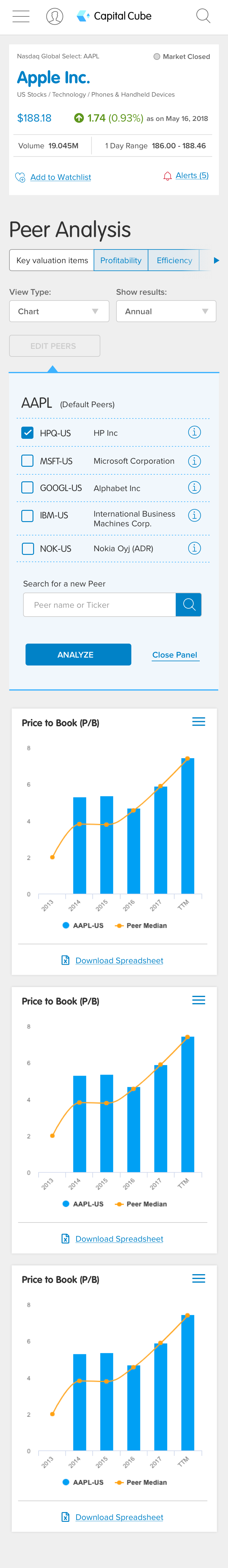
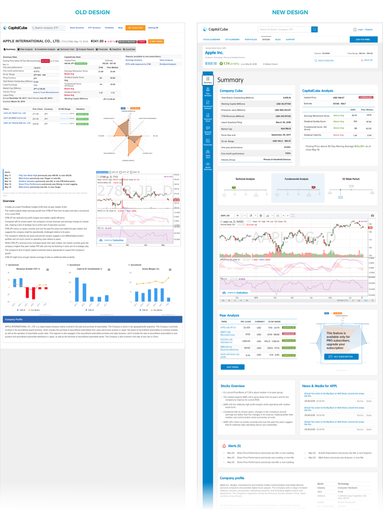
User will land on the page by navigating or searching for a particular stock. This page will have information about the Stock, analysis on this from Captial Cube, Peer analysis information, the performance of this stock in the graph format, news related to this stock and its company profile.
Old design
- Information was all over the place.
- Sections were not organised properly and the information within those sections was disjointed and not giving a complete picture of the page.
- As this site was built in fluid responsive nature, the page acts weird when looked on the bigger screens.
New design
- Followed fixed grid structure, so the information within the sections will be intact.
- Given a clear differentiation between each section and bounded the information within a white box to make it easy for the user to scan the page.
- Added correct iconography to indicate the functionalities on the page.
Eg: In the old design (+) is used to add the stock as a favourite, whereas in the new design we changed it to (heart symbol) which can be easily recognised by the users.
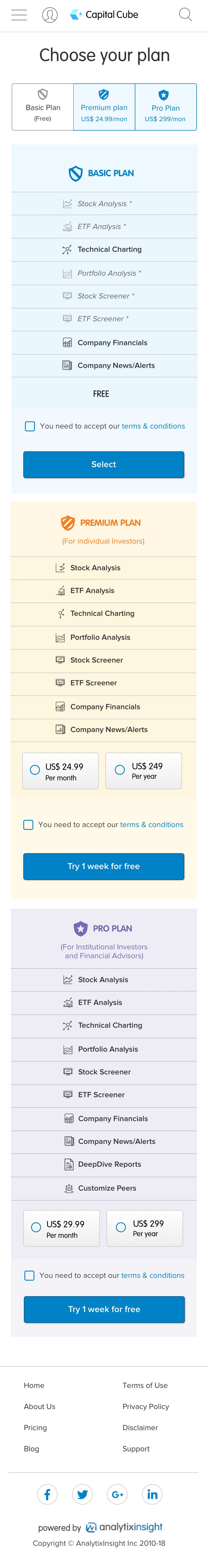
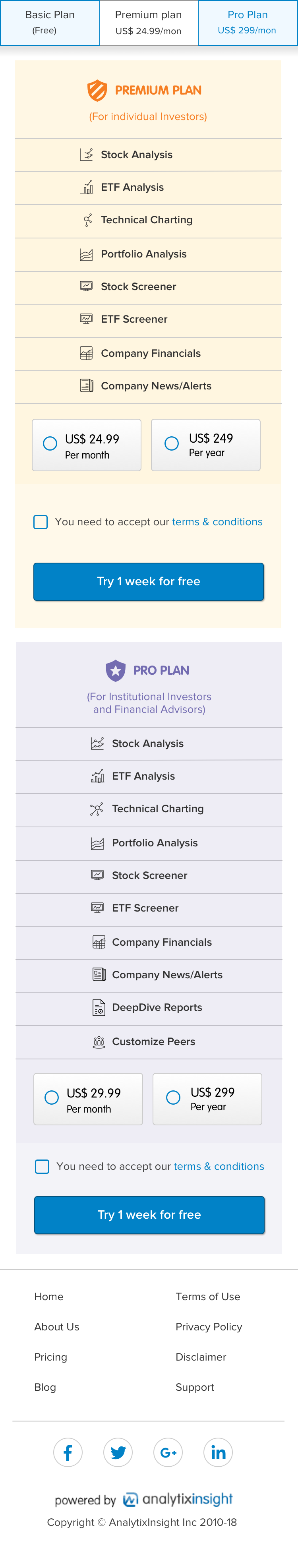
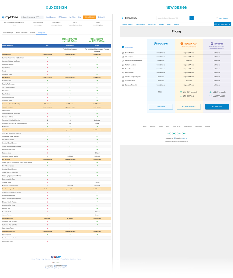
Any customer can access this page by clicking on a link in the footer. This page contains the pricing information of different plans the site is offering.
Old design
Hard to get an overview of benefits and to compare between the plans, as there is so much information on the page to take in. Even if the user managed to understand the benefits and would like to upgrade, there is no clear CTAs to guide customers about their next tasks.
New design
Implemented progressive disclosure on the page to show the differences between each plan in an easy to digest format. If the user wants to know more information about a particular feature they can dig into further details. CTAs are present on this page to give direction on the user's next steps.
Final Output